I’ve just released Tofu 3.1, an update to my text reader for the Mac. Its interface controls now use the new Liquid Glass appearance on macOS 26 Tahoe, and the app icon has also been adapted for Tahoe, including dark and clear variants. I’ve also done some code maintenance which prepares Tofu for compatibility with future macOS releases.
Like previous versions, Tofu remains free. If you enjoy it, please consider making a donation to support its development.
When I joined Google in 2011, it felt like I was realising a dream. I had been working primarily as a software engineer, with my design activities limited to an unofficial portion of my job and to personal projects in my spare time. Google provided an opportunity to be a full-time interaction designer working with very clever people on widely used products, in a fairytale-like work environment.
But time changes things, including your perspective. In the last 12 years, Google got a lot bigger, making it a very different place to operate in. Also, not everything may turn out like in your dream – for instance, my field (UX) hasn’t developed into the rigorous, science-based discipline I had hoped it would. And, perhaps most significantly, I got to know myself better, learning what I enjoy and what frustrates or stresses me. So a new dream began to form.
I’ve just published a minor update to Licensed, my free app for storing software licenses. It fixes a bug where the contents of the Notes field were not legible when using macOS’s dark mode. Download the latest version here. You can read more about the previous update to version 1.5 in this blog post.
Also, I now gratefully accept donations, in case you enjoy my free apps and would like to support me in developing more in the future (more news on that soon).
Tofu started as an experiment 20 years ago. It was based on a hypothesis that long lines of text and vertical scrolling made it challenging to read on your computer. Arranging text in columns seemed like an elegant way to address both the movement and the line length.
I was amazed at how well the solution was received. Of all the apps I’ve made, Tofu has been the most popular. It’s also the one people missed the most after I announced in 2014 that I wasn’t planning to update it again, especially when the last version became incompatible with macOS releases beyond 10.14.
As requests for an update kept continuing even into 2023, I finally decided to update Tofu to run on modern Macs. I also took the opportunity to make many improvements to usability and layout, increase performance and fix bugs. The result is Tofu 3.0.
In 2014, I announced that I was not planning further development of my Mac and iOS apps. I have a couple of updates on that.
Licensed 1.5 now available
One thing I still intended to do was update Licensed, my Mac app for managing software licenses. That update is finally here. I’m sorry it took so long.
My main motivation was to add an export function, so that you could get your data into other tools such as a spreadsheet, and finally say goodbye to Licensed if you were still relying on it.
But it also turns out that technology moves on in 14 years (yes, that’s how long it’s been!), and the app couldn’t even run at all on recent versions of macOS. So that became the first problem to address. Licensed is now built to run on macOS 10.13 (High Sierra) through 13 (Ventura). This update also increases the chances that Licensed will work with future macOS versions.
Colour management is a pretty arcane subject to most people, even if it’s relevant to their work. I recently spent some time trying to understand it, and encountered two challenges. First, I didn’t find any really clear explanation of the concepts involved. Some are thorough but difficult to follow. Others give practical advice without elucidating the fundamentals. The second problem is that there’s conflicting advice about best practices when designing for the web.
I’d like to take on the challenge of addressing both of these issues. I will first explain some of the basic concepts behind colour management, using illustrations that hopefully make it easier to understand. I will then talk about practical implications for web-oriented design.
How it works
Colours can be described in different ways, for example as a mix of red, green and blue light, or in terms of their hue, saturation and lightness. In each of these colour models, you can think of the dimensions as forming a "space". One such colour space is called CIE xyY, and I’ll use it for my illustrations here. It contains all the colours visible to the average human eye, and has the convenient property that, although it’s three-dimensional, you can look at it "from above" and get a nice, two-dimensional map of chromaticities at maximum brightness:
When you’re working on a particular display, it’ll only be able to show a subset of all visible colours. This range is called its gamut and will have a triangular footprint in the CIE xyY space (as will any other RGB space):
If a colour profile describes a sub-space like this which exactly corresponds to the range of colours your display can actually show, it’s said to be perfectly calibrated.
Wow, that was longer between posts than I had intended.
Seriously, though, I'm sorry for the long silence, and for the lack of updates to my software. I'm going to tell you a bit about what's happening with my apps, my life and this blog.
So what’s been going on?
After many years of working mainly as a software engineer with a passion for design, I managed to fulfil my dream of becoming a full-time interaction designer in 2011 by joining Google. I moved from London to Switzerland to join their office in Zurich, where I live today.
Previously, my creative energy needed an outlet outside my job, which my free Mac and iOS apps provided. Since becoming a full-time designer, I feel that much less of my capacity has been available to put into extra-curricular projects.
Let me tell you my plan for each of my apps. There is a general theme of retirement, but I think these are the right decisions to make, and, as I explain at the end, I intend to direct my energy into efforts that I hope will be of more benefit.
Tofu 2.0 was released yesterday, which allows reading simple PDF documents, has a less obtrusive full-screen mode, supports scrolling on MacBook trackpads and is a Universal Binary (that is, it includes a native build for Intel Macs). An alpha version with most of these features had been available for quite some time, but it had some bugs, and it only recently dawned on me how to solve the trackpad problem.
I have since released revision 2.0.1, which fixes some bugs in yesterday's release.
In case you don't know what Tofu is: it tries to make reading text on the screen more pleasant by wrapping it into columns, which you navigate from left to right without ever scrolling vertically.
There was once an appearance theme for Mac OS 8 and 9 called Neutech, by Flanksteak Design. I don't think I particular liked the theme as a whole, but it included a desktop background that has been my favourite background for the last eight years or so since I discovered it:
Here's a detail:
I have made sure I that I always have a copy, which has survived across all the different Macs I've used since. However, the image is only 1024 × 768 pixels, which wasn't small at the time, but makes the image look rather pixelated and blurry on modern displays. I have made several attempts in the past to reproduce it in Photoshop, but never got very far. Today, I sat down again with renewed determination and finally found the secret recipe to emulate the look of the original:
One thing that really helped here was Photoshop CS3's Smart Filters, because I could experiment and keep tweaking the many effects I had to apply. This also means that I can easily produce updated versions in the future as screen resolutions increase.
Sorry to be late by a week or so, but there are several reasons why I didn't get a Leopard-compatible update to Namely out sooner.
First of all, I didn't have Leopard any earlier than most of you; I bought it on Friday the 26th of October at the Apple Store on Regent Street. That's because unlike many Mac developers who dedicate a lot more time to this stuff and who have an income from it, I don't have a Select membership with the Apple Developer Connection.
Secondly, I decided to try out Leopard's improved support for application launching through Spotlight before putting any effort into updating Namely. Ever since Scott Forstall had hinted at this feature at the World-Wide Developers' Conference in 2006, I had been feeling a bit anxious about Leopard rendering Namely redundant. (I generally think it's a good thing when Apple fills a gap that was identified and addressed by third-party developers, but nevertheless, we do tend to fall in love with our applications.) My verdict: Spotlight is not bad, but it didn't win me over. I didn't spend enough time with it to figure out how clever it is about choosing between candidate matches (it seems to at least take into account which app you chose last time), but long enough to find a few things that I didn't like about it:
A lot of stuff happens visually in the Spotlight menu, which distracts from your main task: quickly identifying the application you want to launch.
The icons of listed apps don't always appear straightaway.
It only shows three matches, so it's effectively a bit less tolerant.
I guess these things shouldn't be an issue if you only occasionally need an application that's not in your Dock. Finding it through Spotlight will still be much faster than navigating to it in the Finder. But I think that if you use Namely (or, for that matter, any other keyboard-based launcher) for most of your application launching, anything that isn't super-fast isn't fast enough. When I launch an application, I don't want to think much, and I don't want to see much. I just want to launch it. Although Namely's sorting isn't perfectly predictable because it adapts over time, it stabilises quickly enough so you can be pretty confident about what it will suggest when you type something.
The third reason for the delay is that I just wasn't sure what to release. I have been (slowly) working on Namely 3.0, which is controlled through a preference pane and doesn't show up in the Dock. So I was considering finishing that off rather than releasing another update to Namely 2.x. However, I wasn't confident that I could get Namely 3 finished and stable within a few days, so I decided to push out a minor update in the meantime.
Here it is. Annoyingly, I couldn't find a way to make it work on both 10.3.9/10.4 and 10.5 (I link against the 10.5 libraries in order to support Spaces, but this seems to stop Apple's secret application-listing function from working on 10.4), so I had to leave version 2.1 available as a separate download.
One of my pet peeves in web interfaces has always been that on radio buttons and checkboxes, only the small button itself is clickable. In native Mac and Windows interfaces, you can usually click on the text labels of these controls as well, giving you a much larger target, which, in accordance with Fitts' Law, makes them faster to hit.
Many, or perhaps most, people would probably never notice this difference in behaviour because they have only ever tried clicking on the button proper; the text doesn't visually suggest that it's clickable. But for those of us who are used to this shortcut, the standard web behaviour will catch us out every time. (Actually, I've started to wonder whether I'm the only person on the planet to click on the text labels, since I've never heard anyone else complain about this issue.)
Until a few months ago, I thought this was all just an unfortunate but inevitable limitation of HTML, and that developers found it too much hassle to implement a workaround in JavaScript. Then, I discovered HTML's label element. If you mark up a piece of text as a label and set its for attribute to be the ID of a form control, it becomes the "official" label for that control. The practical effect of this is that in most browsers, clicking the label will actually do something useful. For checkboxes and radio buttons, it will toggle their state, while for text fields, it will put the focus on the field. This works in Internet Explorer 6(!) and 7, Safari (I only checked version 3.0.2), Firefox and Camino. OmniWeb will do it in the upcoming 5.6 release.
results in nice, fully clickable controls like this:
There's also an alternative, simpler syntax that doesn't require using the for and id attributes. Instead, you can just make the label element a parent of the control:
<label>
  <input
   type="radio"
   name="os"
   value="mac">Mac user
</label>
However, this does not work in Internet Explorer 6, so if you want to be inclusive, stick with the more explicit syntax.
I have recently taken a great liking to the idea of design languages, which think of design as a form of communication between the designer and the user, and which provide a framework or style to work within when you’re creating a design.
Design languages are sort of like design guidelines, but specifically thinking of them as a language is helpful at several levels:
It provides the designer with a repertoire of visual “expressions” and constructs that have a specific meaning, helping them to express their ideas without reinventing the wheel.
It encourages the designer to stick to the rules and conventions of the platform. In the same way that you usually wouldn’t just throw a Russian sentence into a conversation you’re having in English, you shouldn’t use interface elements or interactions that your user won’t be familiar with.
A language is something users can learn. They can then transfer their knowledge between systems that use the same design language.
It gets the designer to think of their design as a form of communication, a way to convey the conceptual model and the functioning of the system to the user. It effectively promotes empathy.
On the Mac, the Macintosh Human Interface Guidelines (HIG) define the design language third-party developers (and Apple themselves) are supposed to use in their software. The HIG were once an exemplar of design languages. However, since the introduction of Mac OS X, rather than prescribing the design of interfaces, the HIG have developed a tendency to describe it, being frequently updated to reflect whatever new “conventions” the designers of the Finder, Mail or iPhoto have come up with, sometimes with rather unconvincing logic. The Mac’s design language has subsequently become rather bloated and flaky.
Take as an example one of the simplest interface elements of all: the pushbutton. I’m sure most long-time Mac users can easily recall what a pushbutton looked like on System 6 and 7:
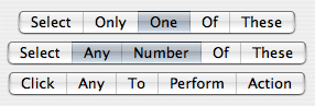
In Mac OS X 10.4, it’s not so easy to say:
Taking the language metaphor a bit more literally, one could say that these are synonyms for the same concept. Worse than synonyms are homonyms, because they introduce ambiguity:
The segmented control can be cofigured to behave in three very different ways, and the only way to figure out which is the case is through trial and error or by guessing from the context. A more traditional way to express the same functionality unambiguously would be:
When Aqua first appeared, it was like a fresh start. It actually seemed simpler than Mac OS 9 in terms of its interface elements. However, Apple hasn’t been very disciplined with keeping it that way, and it’s quite astonishing how quickly the Mac design language has grown through influences from the different application teams' designers.
You could argue that these inconsistencies are just cosmetic matters of graphic design rather than of interaction, since the way Mac OS X’s interface functions is still relatively simple and coherent. But you have to remember that the graphical representation of the interface is the only communication channel from the designer to the user; we rely on it to understand what we can do, in the same way that you’re relying on my use of English to understand this article. It’s a language.
There’s a chapter on design languages by John Rheinfrank and Shelley Evenson in Terry Winograd’s book Bringing Design to Software (parts of this book are available online). Donald Norman has also written an essay about this entitled Design as Communication.
Some people have been asking me whether there will be an Intel-compatible version of Prefling. Unfortunately, the answer looks to be no.
Prefling relies on a neat little library which was created by Brian Webster and accompanied by an article on Stepwise. This library provided the basis for most docklings that came out when these things had their glory days. Unfortunately, Brian is not planning to port his library to Intel. This is perfectly understandable. Docklings have been deprecated by Apple for a long time, and I’m one of the last developers to still use them. The API could be killed any day, most likely when the Dock gets an overhaul (perhaps in 10.5?). Also, the dockling server is a bit flaky anyway, sometimes stopping docklings from working until you log out and back in.
Most functionality offered by docklings can now be added to normal applications by controlling their icon and Dock menu. But there’s one thing that using an application doesn’t offer, and it’s precisely the essence of Prefling’s concept: that you can show its menu with a simple click. Applications require clicking and holding or control-clicking/right-clicking to show their menu.
The only alternative I can see would be to make Prefling a “menu extra”. However, I don’t feel that it’s worth the effort, since there are already two other such solutions out there: the aptly named MenuPrefs, which is already Intel-compatible but not free, and the also very aptly named PrefsMenu, which has not been ported yet. And anyway, what would I call mine, now that all the possible permutations of “menu” and “prefs” have been used?
So, dear fans, after 29,684 Versiontracker downloads (my record so far), it looks like this is the end of the road for Prefling. I’m glad you enjoyed it while it lasted.
Since the introduction of Mac OS X, Apple has been doing a great job of offering more and more functionality at the operating system level that application developers used to have to implement themselves. Spell checking, Address Book, Keychain, Dictionary, disk burning and PDF support are some good examples. Almost everyone wins when this happens: users get a consistent experience and are less dependent on particular applications, and developers have less work to do and can simplify their application code. The only ones who potentially lose out are developers who had seen the gap and were actually trying to offer such a service to other applications, like, for example, Nisus Thesaurus or Adobe Acrobat Distiller.
When I recently saw this post on the Omni Group forums by Jon Hicks, I saw another perfect candidate for Apple to assimilate: the download manager. As it stands, at least six applications on my machine implement their own download managers: OmniWeb, Safari, Firefox, Camino, NetNewsWire and Transmit. And, as Jon pointed out, they all have different UIs.
So what would such an Apple download manager have to offer? It would of course need to support the most common protocols, including HTTP and FTP. (Perhaps even BitTorrent and Gnutella? Maybe not, since Apple wouldn’t want to make life any easier for those not using the iTunes Music Store.) Pausing and resuming downloads would be a must, too. The interface would need to offer enough functionality to compete with most browsers, but be simple enough for the non-geek.
Out of the applications mentioned above, I personally like OmniWeb’s download manager best, because it has a toolbar that offers some useful commands with a single click, like “abandoning” (clearing and trashing) a download. Also, all its commands have text labels. It doesn’t present any puzzles and coordination exercises in the form of little grey circles and pop-up buttons. However, I do like how other apps have managed to be more horizontally compact by putting the progress bar on its own line below the file name.
Again, someone might lose out if Apple were to offer an OS-wide downloading framework. If it offered enough functionality, it could be developers of apps like Download Wizard, iGetter and Speed Download. But, speaking with my user-hat on, I’m afraid I wouldn’t care.
When colour labels made a return in Mac OS X 10.3 Panther after years of waiting, it was a bit of a letdown. For most, this was because they were functionally the same as what the Classic Finder used to offer. Personally, however, I don't really need more than 7 colours, and the colours are distinct enough, so I don't really feel the need to customise them either.
But this doesn't mean that I was happy when I saw the new implementation. It wasn't a matter of functionality, but one of visual design. Consider this:
Somehow this look immediately made me think of Windows XP, with its overpoweringly saturated, bevelled window frames and buttons. It just didn't look like Apple. But even leaving taste aside, it simply doesn't work very well. The colours are so strong and dark that it becomes harder to read the actual names of the folders. And why those gradients? They just add more clutter.
In his book Visual Explanations, Edward Tufte explains the principle of the smallest effective difference, which implies using the most subtle visual distinctions that still achieve the desired effect. The word effective is important here. There's no point using the smallest perceivable difference if it doesn't tell the story you want it to tell. In case of Finder labels, I see two possible desired effects:
To allow you to quickly spot all the files of a particular colour, whose meaning you have memorised, e.g., "All archived stuff is grey."
To bring certain files to your attention that you have previously marked with that intention, e.g., "I must review this document, so I'll make it red to remind myself later."
So applying the principle of the smallest effective difference for Finder labels would mean finding a set of colours that fulfil these two purposes when set against the white background of a window.
You can now easily read all the folder names and ignore the labels if you wish, but you can still choose to focus on all the files of a particular colour. Toning down the labels also makes the selection much more prominent. (Also notice I tried to improve how the labels of selected items are shown.) Although the colours look paler, they are still bright enough to have an attention-grabbing quality, especially in isolation:
It's a real shame how simple, proven design principles like this are ignored for the sake of eye candy (and not very good eye candy in this case). I think what we need is an option in the system preferences to switch from "Shop Demonstration Mode" to "Work Mode".
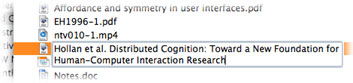
I've been downloading a lot of research articles recently. In order to be able to identify them easily, I like to put the author and full article title in the file name. Many of these articles have titles that sound like "Bla bla bla: A new model for bla bla bla", i.e. something containing a colon. Of course, the Mac doesn't allow using colons inside file names. Although annoying, I think this is forgivable. What is not forgivable, however, is that if you mistakenly include a colon, everything you've typed is lost and the file name is reverted back to what it was before you started:
The same thing happens if you try to use a name that's already used by another file.
Notice also that the message doesn't tell you what is wrong with the name, so novice users have to rely on trial and error to find acceptable file names.
Finished sooner than expected, Namely 2.0 is now ready for your launching pleasure. The most obvious change is that it has a new, customisable look. I spent many hours (literally) tweaking the matte and shiny shading algorithms and the different colour presets. I hope it caters for the majority of tastes.
It is also smarter about how it orders matches. It will keep track of how often you launch which apps, and will give more frequently used ones precedence in the list. The result should be that you can open many of your favourites with just a single letter.
There are other changes as well, so check out the Read Me file.
When Apple introduced the iTunes Music Store, one thing I hated about it straightaway were those views that have left and right buttons to page through a list of albums. At first I thought it was forgivable, given that the iTMS is more like a web site than a rich client interface. But after a short while I noticed that my eyes had become conditioned to move after clicking those arrows, trying to follow the animation. The problem is that they would never be in sync with the actual animation, especially since there's always a delay, which conjured up my old friend, motion sickness. I've now actually developed a habit of looking away right after clicking the arrows, and look back only after the animation is over.
When Tiger arrived, I was shocked to see the same awful paging view used in the Dashboard when you're adding widgets. The delay there is not nearly as bad as in the Music Store, but why on earth would you not use scrollbars for something like this?
It baffles me how Apple, out of all companies, keeps throwing decades worth of interface design wisdom out the window. They've done it with window title bar controls, with the Dock and with the Mail toolbar, to name just a few obvious examples. Jef Raskin once said that instead of interface architects, Apple has been infested with decorators. I think he had a point.
Although some kind people have offered me money for my software in the past, I never felt accepting it was quite justified, because I was full-time employed and only spent very little time on my products.
Well, starting today, I'll be accepting donations through a link at the top of my website. This is a) because I'm planning to spend more time on my software (within the constraints of my studies), and b) now that I'm a student, I don't mind the extra money so much.
As you may have already noticed, I've put up a pre-release version of Tofu 2.0 which includes PDF support. There are a number of other releases in the pipeline as well: Deep Notes is getting some interface enhancements, I'm looking to improve Namely, and there's a brand new CoreData app for storing software licenses, pending only a name and an icon (if you have an idea less boring than License Manager, let's hear it!)
I have been using a Mighty Mouse for about a month now which I got as a leaving present from my kind colleagues, so I thought I'd share my impressions. I intentionally waited for a few weeks to allow myself time to get used to it.
Up to now, my mouse of choice has been a Microsoft Wheel Mouse Optical, a two-button mouse (three if you count the scroll wheel). I really like the shape, the feel of the buttons, and its durability.
One of my first thoughts when I started using the Mighty Mouse was that the button was too hard to press. I searched for a switch to adjust the firmness, as I had seen on the Apple Bluetooth Mouse, but no luck. I got used to it eventually, but initially this caused my hand to get tired quite easily. It's a shame they don't have the adjustment feature across all their mice. I can't see any obvious reason for not including it.
Another reason why my hand and wrist felt tired was that I was used to resting my hand on my Microsoft mouse, which is quite high at its highest point. The Mighty Mouse is much flatter. Also, I think because the whole surface forms the button, I felt hesitant to put too much weight on it.
What people probably wonder about most is how well right-clicking works. At least I did. As you may have read elsewhere, it requires you to actually lift your index finger off the surface. As long as your finger touches the area to the left of the scroll ball (for the right-handed setting), any clicks are registered as primary clicks. I wasn't sure if this would be a problem, because I didn't actually know whether or not I usually lifted my index finger. Well, it turns out I didn't. On other mice, I was just applying more pressure on the right side. I wouldn't say that getting used to Apple's prescribed technique was hard, but it did take some conscious effort at first. I still fail very occasionally, even after four weeks of using it.
The side buttons are also interesting. You squeeze them to activate them, but although they give slightly, there's no tangible click. Instead, you get feedback in the form of a clicking sound from the built-in speaker. This sounds very natural and I find it actually gives you the illusion of feeling the click as well. It's only when the mouse is disconnected and has no power that you're sure there's no physical click. Of course, this whole concept breaks down if you are in a noisy environment or if you are deaf. Also, the buttons really give only slightly, so I tend to apply quite a lot of pressure, which is tiring.
I have to say I don't really use the side buttons. The main reason is their positioning. When I hold the mouse in a natural position, my ring finger is on the side button on the right, but my thumb is just behind the left one. So to get a grip, I either need to move forward my thumb (and therefore my wrist) or hold the mouse slightly angled to the left. This is kind of crappy, since it seems like an obvious problem and shouldn't be hard to fix (just make the buttons wider, spanning further back).
On to the Mighty Mouse's other big curiosity: the scroll ball. Let's look at traditional, vertical scrolling for now. In a nutshell, it feels great. Scrolling is much smoother than on other mice, because it seems to have a higher resolution. Scrolling produces soft clicking sounds, which are artificial like on the side buttons, but here the illusion of tactile feedback is even more convincing. Also, you have to apply a tiny bit of pressure while using it, so if you touch it very lightly and move it, nothing happens. I guess the reason for this behaviour is to avoid accidental scrolling when you brush over the ball while moving your fingers. Apple did an amazing job of tuning the threshold for this so you probably will never notice.
What I was looking forward to most in this mouse is the idea of being able to scroll horizontally without having to hold the Shift key. Unfortunately, the result here has been disappointing. It works, but it doesn't work very well. The problem is one of ergonomics. To scroll vertically, you can use about an inch of your index finger's length to move the ball, from the tip of the finger to just behind the first joint. This not only gives you a fairly good range, but also very fine control. In contrast, when scrolling horizontally, only a very narrow part of you finger can make contact with the ball, so you have to keep scrubbing to scroll longer distances. That could be fixed by accelerating horizontal movement more than vertical, but the other problem is that horizontal scrolling is very hard to control. This is partly due to the limited range, of course, but also because your finger sticks to the shiny surface of the mouse on either side of the scroll ball. When you apply more force to overcome that stickiness, your finger suddenly sweeps across the ball much faster than you intended, resulting in very jerky movements. It can be quite frustrating.
I can think of two possible improvements. One is to make the surface rougher, at least around the scroll ball. The other is to expose a bit more of the sides of the scroll ball, by making the surface of the mouse slightly concave at the top.
The other thing you can do with the scroll ball is click. The thing to note here is that it's not the depressing of the scroll ball which causes the click, but pressing the whole mouse down while your finger is on the scroll ball. In fact, the same pressure detection used to activate the scroll ball when scrolling also seems to give the condition for a middle click. This means that a middle click doesn't actually feel any different from a normal click, which can be a bit confusing. But at least you don't have to lift up your other fingers in order for it to work.
So the Mighty Mouse delivers many novel ideas, but how well these work is quite a mixed bag. Vertical scrolling is the only real winner. Once you're used to this one, traditional scroll wheels will feel clunky and primitive. Although some of the other features, like horizontal scrolling, are potentially useful, others feel like they're just there to make the mouse as unconventional as possible.
Innovation is appreciated, but not just for the sake of innovating.