There is no shortage of software metronomes in this world. I imagine that many people pick it as an exercise when learning to design or program, believing it to be a nice and simple task.
Yet despite this abundance of options, I didn’t find one that I was satisfied with. They all somehow missed the mark, not so much in terms of functionality, but in terms of usability and quality.
So I set out to create Tachyo, a new metronome for iOS. But getting there turned out to be an even deeper design and implementation challenge than I had anticipated.
Tachyo is a new metronome for iOS. It’s my first new app in 15 years, and also my first project after going fully independent earlier this year.
Now, you may ask if there aren’t already enough other metronome apps out there. There certainly are many. But, as is so often the case when I look for software, I haven’t found any of them to be quite satisfactory.
Beyond the obvious functional requirements (and my personal ones are actually quite basic), there are a number of usability and quality requirements that I think tend to get ignored.
Colour management is a pretty arcane subject to most people, even if it’s relevant to their work. I recently spent some time trying to understand it, and encountered two challenges. First, I didn’t find any really clear explanation of the concepts involved. Some are thorough but difficult to follow. Others give practical advice without elucidating the fundamentals. The second problem is that there’s conflicting advice about best practices when designing for the web.
I’d like to take on the challenge of addressing both of these issues. I will first explain some of the basic concepts behind colour management, using illustrations that hopefully make it easier to understand. I will then talk about practical implications for web-oriented design.
How it works
Colours can be described in different ways, for example as a mix of red, green and blue light, or in terms of their hue, saturation and lightness. In each of these colour models, you can think of the dimensions as forming a "space". One such colour space is called CIE xyY, and I’ll use it for my illustrations here. It contains all the colours visible to the average human eye, and has the convenient property that, although it’s three-dimensional, you can look at it "from above" and get a nice, two-dimensional map of chromaticities at maximum brightness:
When you’re working on a particular display, it’ll only be able to show a subset of all visible colours. This range is called its gamut and will have a triangular footprint in the CIE xyY space (as will any other RGB space):
If a colour profile describes a sub-space like this which exactly corresponds to the range of colours your display can actually show, it’s said to be perfectly calibrated.
I never used to be particularly interested in designing mobile applications. I just thought it was a hopeless platform, plagued by tiny screens and keys that were designed for inputting numbers (how often do you actually type numbers into your phone?) I also had never thought of my phone as something that I want to use for various applications. This scepticism had become so ingrained that I initially didn't even see much point in Apple opening up the iPhone for third-party developers. I thought it might destroy the purity of this well-designed platform if developers were suddenly given reign over users' mobile screens.
However, two months ago or so, a certain curiosity, a thirst for a new challenge and a feeling that I was missing a boat (to where I did not know) combined to make me go out and buy an iPod touch (I don't want to buy an iPhone because my current phone deal is too good to give up). I almost immediately appreciated both what a well-designed platform it is and what a compelling playground the third-party application market represents, for users and developers alike.
The Handbook of Human–Computer Interaction, edited by Martin Helander, Thomas Landauer and Prasad Prabhu, is a book published in 1997 that attempts to summarise research relevant to the design of interactive software and hardware. Its 62 chapters fill 1500 pages and provide advice on a multitude of topics, covering analysis, design and evaluation of interactive systems, as well as the psychological and ergonomic underpinnings of human–computer interaction. One of those chapters is titled Keys and Keyboards and was written by James Lewis, Kathleen Potosnak and Regis Magyar. It considers virtually every imaginable factor involved in designing keyboards, and, by drawing from experimental studies, provides recommendations for each of them. Ever since I read this chapter a couple of years ago, I've been meaning to summarise some of their conclusions and to consider them in the context of modern keyboard design. The recent string of keyboard-related links on Daring Fireball (e.g. here, here, here, here, here and here) moved me to finally sit down and do it, so here it is.
For a few weeks now, my two team-mates at work and I have been using a “horizontal” whiteboard, lying across the desk surface between us. I had been wanting to try this for a while, but it wasn’t possible because of our previous desk arrangement. Now that we have this large area of space between us and no partitions, this small whiteboard fits perfectly without getting in the way.
We’ve found ourselves using it virtually every day, illustrating explanations, walking through calculations and brainstorming design ideas. Visitors will intuitively pick up a pen and start using the whiteboard when explaining things. It somehow seems to invite people to use it more than most whiteboards. However, it’s not only a collaborative tool: it also makes a great scratch-pad when you’re brainstorming on your own. To ensure that it stays useful, we make an effort to keep the board clean; nothing tends to stay on there for longer than a day or so.
Overall, it’s being used far more than any wall-mounted whiteboards we’ve had near us, and I think this is due to two key differences to wall-mounted boards. Firstly, each one of us can reach the board very easily without having to get up. You just turn your chair slightly and there it is. Secondly, the whiteboard is between us, so it feels less like a presentation aid and more like a collaborative work surface, accessible equally well from all sides.
If your work involves collaborative problem-solving, and if your desk arrangement allows it, I highly recommend setting up a whiteboard like this. Don’t make it too big, because you won’t be able to reach all corners and it will also eat into your desk real-estate. I think ours is 90×60 cm, which is just right. I also recommend investing in some pens with a finer tip than the standard ones you tend to get. Those are designed to be visible from a few meters away, but you’ll find them too thick for handwriting at a comfortable size for close-up work. Edding do quite a range of dry-erase board markers.
One of my pet peeves in web interfaces has always been that on radio buttons and checkboxes, only the small button itself is clickable. In native Mac and Windows interfaces, you can usually click on the text labels of these controls as well, giving you a much larger target, which, in accordance with Fitts' Law, makes them faster to hit.
Many, or perhaps most, people would probably never notice this difference in behaviour because they have only ever tried clicking on the button proper; the text doesn't visually suggest that it's clickable. But for those of us who are used to this shortcut, the standard web behaviour will catch us out every time. (Actually, I've started to wonder whether I'm the only person on the planet to click on the text labels, since I've never heard anyone else complain about this issue.)
Until a few months ago, I thought this was all just an unfortunate but inevitable limitation of HTML, and that developers found it too much hassle to implement a workaround in JavaScript. Then, I discovered HTML's label element. If you mark up a piece of text as a label and set its for attribute to be the ID of a form control, it becomes the "official" label for that control. The practical effect of this is that in most browsers, clicking the label will actually do something useful. For checkboxes and radio buttons, it will toggle their state, while for text fields, it will put the focus on the field. This works in Internet Explorer 6(!) and 7, Safari (I only checked version 3.0.2), Firefox and Camino. OmniWeb will do it in the upcoming 5.6 release.
results in nice, fully clickable controls like this:
There's also an alternative, simpler syntax that doesn't require using the for and id attributes. Instead, you can just make the label element a parent of the control:
<label>
  <input
   type="radio"
   name="os"
   value="mac">Mac user
</label>
However, this does not work in Internet Explorer 6, so if you want to be inclusive, stick with the more explicit syntax.
When I spent three months at Microsoft Research last year, I came across a lot of fascinating work related to interaction design. Colleagues would talk about their projects, people would report back from conferences, visitors came in to present their work, and I found things during literature reviews. Some of the designs I saw and read about were so cool that I couldn't believe they weren't more well known. Even my friends and I, who were supposed to be into design and human-computer interaction, hadn't heard about them. There was an obvious problem here.
I think the reason for this lack of dissemination is that the main way for researchers to make their ideas known is through conferences, journal articles and coffee-break chats. All three of these channels have only other researchers at the receiving end.
Most of the published literature is available online, but very often not free of charge. Researchers usually have access to relevant digital libraries through their employers, but designers and other potentially interested people are unlikely to be willing to pay.
Of course, many papers are available for free. However, a further barrier is that the format and language of scientific papers is not what non-researchers would consider an easy and engaging read. Given this "language barrier", as well as the prerequisite knowledge required for a lot of the material, you won't find many people casually reading the latest CHI conference proceedings on the train or flipping through a 20-page research study during their lunch break.
There is one web site which has addressed this same problem, albeit not for interaction design-related research. Ars Technica's Nobel Intent journal supplies those who have a casual interest in science with digests of interesting studies. These are written in a fairly casual style, usually include any necessary background knowledge, and only take a few minutes to read.
It didn't take much ingenuity to realise that such a model may be exactly what is needed to break the barrier that I had witnessed in human-computer interaction research. I got a few friends from university to join me in the effort to get something rolling. Well, after a few months of planning, designing, building and writing, the result is finally here: http://uiscape.com
I sincerely hope you find it interesting and that it will help get many more people excited about the work that's going on out there.
If you have any questions about the concept or design of the site, you can comment here or email me.
I recently had to implement an HTML table in a web application that would display and allow editing rows of data. However, the number of rows you’ll get in the data is very uncertain. To avoid a ridiculously long web page, the table should not grow beyond a certain height and should instead show a scrollbar when there are more rows than can fit.
One thing that I find can be quite annoying is if a table is just a little bit too short for its contents, so that you end up with a single row off the bottom, for example an eleventh row in a table that is only ten rows high.
As a little experiment, I decided to make use of the table’s flexible height to prevent this situation: we would display an extra row if the number of rows is only one more than our ideal maximum height. So if your ideal limit is ten rows, it would stretch to accommodate up to eleven rows. For twelve rows or more, only ten would be shown at a time. This way it always feels like the scrollbar is justified, because it’s never just to get to that one extra row. I think it’s unlikely that users would notice this behaviour.
However, I am not sure whether this is a valid design decision. One could argue that since your true maximum is eleven rows, not ten, you are making life a little bit harder than necessary for your users whenever they have to scroll. Also, I have no empirical information about whether and how much people actually get frustrated in cases where only one row is out of bounds. It almost becomes an ethical question: is it worth a white lie?
I think the approach may be valid in some cases, but it depends on several factors:
What is your maximum height? If your table can grow fairly high before showing its scrollbar, the cost of sacrificing a single row for this trick is less. However, if it can only be a few rows high, you are depriving users of a significant proportion of display area.
How likely will you exceed that maximum? If scrolling will be necessary in the majority of cases, it may be wiser to grant people the extra height to maximise how much they can see at a time.
How linear is the task? If people only need to read down the list of rows once, having to scroll a single row into view at the end is no big deal. But it might get frustrating when they have to repeatedly jump back and forth to compare or edit rows.
In my case, the table is fairly likely to contain tens or hundreds of data rows, and I only have space to show about a dozen at a time. So scrolling will often be necessary, and users will probably value every row they can fit on the screen. I’m not sure yet how likely people are to scroll back and forth, but the other two factors are probably enough to outweigh any gain in happiness that might result from not having a single row out of bounds.
Whenever you see the rumoured next-generation video iPod mentioned, the expected features always include a huge screen covering the front of the device and a “virtual”, touch-screen-based click wheel.
I may be missing something here, but what exactly would be the point of that? The reason the iPod has a scroll wheel is to make scrolling easier on a device that doesn’t allow more direct manipulation of screen content. If you had a touch screen, the grounds for having a scroll wheel would disappear, and you could just use a scroll bar, right? A scroll bar would allow scrolling directly to any point in a list and would involve less (and less awkward) physical movement.
Also, if you had such a nonsensical, virtual scroll wheel, you’d be waving your thumb around over the contents of the screen all the time, which doesn’t sound like a clever idea. Of course, you could dedicate a section of the screen for this wheel, but wouldn’t you rather use that space to make the list taller?
So I think either the creative minds behind the rumour sites didn’t think this one through properly, or the creative minds at Apple are making some rather silly decisions. Let’s hope it’s the former.
A lot our interaction with technology is indirect, through controls, such as buttons and knobs, that affect the behaviour of some part of a system in some way. A common principle for making these controls easier to understand and remember is to make their physical functioning and arrangement analogous to the functions they control. For example, you move the mouse on your computer to the left to move the pointer left. This is called a natural mapping. An example of an “unnatural” mapping is the QWERTY keyboard. Some mappings can’t really be made natural, because they involve non-spatial concepts. For instance, there is no right answer as to whether the left or the right button on your mobile phone should pick up a call.
A popular example for illustrating mappings was given by Donald Norman in The Design of Everyday Things and involves kitchen stoves:
Although some stoves at least use the two knobs on one side to control the two burners on the same side, it is not clear, without reading the labels (usually at the front of the stove, out of a standing adult’s line of sight), how they map to the front and back. Personally, I've been close to destroying kitchen utensils and causing minor injuries more than once. Norman suggests the following as better alternatives:
An obvious reason I can see for not using these designs is the extra space they need. I don’t know about America (where everything is big) but here in Europe, stovetops are usually roughly square, and I can imagine that manufacturers of stoves and of kitchens would prefer to keep them that way. In any case, I’m sure most users wouldn’t be willing to sacrifice precious kitchen space for a more natural mapping of stove controls.
Instead of shuffling around burners, why not leave them where they are and just move the controls instead. A subtle shifting is all that’s needed (I included a version for controls on the stovetop as well):
It’s not a perfectly natural mapping, but the arrangement contains enough information to be unambiguous, and I imagine that you’d get used to it very quickly.
I have recently taken a great liking to the idea of design languages, which think of design as a form of communication between the designer and the user, and which provide a framework or style to work within when you’re creating a design.
Design languages are sort of like design guidelines, but specifically thinking of them as a language is helpful at several levels:
It provides the designer with a repertoire of visual “expressions” and constructs that have a specific meaning, helping them to express their ideas without reinventing the wheel.
It encourages the designer to stick to the rules and conventions of the platform. In the same way that you usually wouldn’t just throw a Russian sentence into a conversation you’re having in English, you shouldn’t use interface elements or interactions that your user won’t be familiar with.
A language is something users can learn. They can then transfer their knowledge between systems that use the same design language.
It gets the designer to think of their design as a form of communication, a way to convey the conceptual model and the functioning of the system to the user. It effectively promotes empathy.
On the Mac, the Macintosh Human Interface Guidelines (HIG) define the design language third-party developers (and Apple themselves) are supposed to use in their software. The HIG were once an exemplar of design languages. However, since the introduction of Mac OS X, rather than prescribing the design of interfaces, the HIG have developed a tendency to describe it, being frequently updated to reflect whatever new “conventions” the designers of the Finder, Mail or iPhoto have come up with, sometimes with rather unconvincing logic. The Mac’s design language has subsequently become rather bloated and flaky.
Take as an example one of the simplest interface elements of all: the pushbutton. I’m sure most long-time Mac users can easily recall what a pushbutton looked like on System 6 and 7:
In Mac OS X 10.4, it’s not so easy to say:
Taking the language metaphor a bit more literally, one could say that these are synonyms for the same concept. Worse than synonyms are homonyms, because they introduce ambiguity:
The segmented control can be cofigured to behave in three very different ways, and the only way to figure out which is the case is through trial and error or by guessing from the context. A more traditional way to express the same functionality unambiguously would be:
When Aqua first appeared, it was like a fresh start. It actually seemed simpler than Mac OS 9 in terms of its interface elements. However, Apple hasn’t been very disciplined with keeping it that way, and it’s quite astonishing how quickly the Mac design language has grown through influences from the different application teams' designers.
You could argue that these inconsistencies are just cosmetic matters of graphic design rather than of interaction, since the way Mac OS X’s interface functions is still relatively simple and coherent. But you have to remember that the graphical representation of the interface is the only communication channel from the designer to the user; we rely on it to understand what we can do, in the same way that you’re relying on my use of English to understand this article. It’s a language.
There’s a chapter on design languages by John Rheinfrank and Shelley Evenson in Terry Winograd’s book Bringing Design to Software (parts of this book are available online). Donald Norman has also written an essay about this entitled Design as Communication.
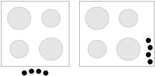
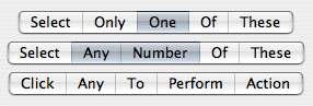
I’ve always been a bit of a pedant, and in that spirit, I would like to write about some use of terminology in interaction design that has been bugging me: affordance. If you’re familiar with the field, the lengthy debates around what the word exactly means may be an old hat to you. Here’s some quick background if you aren’t.
Affordance is a term coined by psychologist James J. Gibson in 1977 to denote the actions an object or environment allows a person to perform. For example, some of a stick’s affordances are touching, picking up and poking someone with. The word is simply a derivative of the verb “afford”.
In his popular (and great!) book The Design of Everyday Things (originally published as The Psychology of Everyday Things), Donald Norman reinterpreted the term to mean those actions which a person can readily perceive to be possible, i.e., those the environment suggests or invites you to perform. Norman’s affordances are a thus a special subset of Gibson’s affordances. They also become something that’s desirable in the design of interfaces; if a button doesn’t look like it can be pressed, the user probably won’t press it.
Norman later realised the discrepancy and has been trying to re-educate the world, who love using his earlier interpretation of the term, but to little avail. Most people nowadays still use affordances to refer to those interactions which are apparent.
It is debatable whether this is a problem. Although Gibson’s meaning is the only logical one, people jumped on Norman’s use for a reason: the meaning he introduced is a very useful concept that needed a name. One could argue that a new word should be invented to signify perceived affordances, but that’s not a very realistic undertaking, since even Norman himself has failed to change people’s minds.
What all the discussions about this terminology seem to overlook, however, is that in adopting Norman’s meaning of the noun, people have also re-applied it back to the verb Gibson’s original term was based on. To afford no longer means “to allow”, but “to suggest” or “to advertise”!
What’s wrong with “advertise”?
I get the impression that people of any particular discipline somehow love having terms that only they understand.
When colour labels made a return in Mac OS X 10.3 Panther after years of waiting, it was a bit of a letdown. For most, this was because they were functionally the same as what the Classic Finder used to offer. Personally, however, I don't really need more than 7 colours, and the colours are distinct enough, so I don't really feel the need to customise them either.
But this doesn't mean that I was happy when I saw the new implementation. It wasn't a matter of functionality, but one of visual design. Consider this:
Somehow this look immediately made me think of Windows XP, with its overpoweringly saturated, bevelled window frames and buttons. It just didn't look like Apple. But even leaving taste aside, it simply doesn't work very well. The colours are so strong and dark that it becomes harder to read the actual names of the folders. And why those gradients? They just add more clutter.
In his book Visual Explanations, Edward Tufte explains the principle of the smallest effective difference, which implies using the most subtle visual distinctions that still achieve the desired effect. The word effective is important here. There's no point using the smallest perceivable difference if it doesn't tell the story you want it to tell. In case of Finder labels, I see two possible desired effects:
To allow you to quickly spot all the files of a particular colour, whose meaning you have memorised, e.g., "All archived stuff is grey."
To bring certain files to your attention that you have previously marked with that intention, e.g., "I must review this document, so I'll make it red to remind myself later."
So applying the principle of the smallest effective difference for Finder labels would mean finding a set of colours that fulfil these two purposes when set against the white background of a window.
You can now easily read all the folder names and ignore the labels if you wish, but you can still choose to focus on all the files of a particular colour. Toning down the labels also makes the selection much more prominent. (Also notice I tried to improve how the labels of selected items are shown.) Although the colours look paler, they are still bright enough to have an attention-grabbing quality, especially in isolation:
It's a real shame how simple, proven design principles like this are ignored for the sake of eye candy (and not very good eye candy in this case). I think what we need is an option in the system preferences to switch from "Shop Demonstration Mode" to "Work Mode".
I've been downloading a lot of research articles recently. In order to be able to identify them easily, I like to put the author and full article title in the file name. Many of these articles have titles that sound like "Bla bla bla: A new model for bla bla bla", i.e. something containing a colon. Of course, the Mac doesn't allow using colons inside file names. Although annoying, I think this is forgivable. What is not forgivable, however, is that if you mistakenly include a colon, everything you've typed is lost and the file name is reverted back to what it was before you started:
The same thing happens if you try to use a name that's already used by another file.
Notice also that the message doesn't tell you what is wrong with the name, so novice users have to rely on trial and error to find acceptable file names.
When Apple introduced the iTunes Music Store, one thing I hated about it straightaway were those views that have left and right buttons to page through a list of albums. At first I thought it was forgivable, given that the iTMS is more like a web site than a rich client interface. But after a short while I noticed that my eyes had become conditioned to move after clicking those arrows, trying to follow the animation. The problem is that they would never be in sync with the actual animation, especially since there's always a delay, which conjured up my old friend, motion sickness. I've now actually developed a habit of looking away right after clicking the arrows, and look back only after the animation is over.
When Tiger arrived, I was shocked to see the same awful paging view used in the Dashboard when you're adding widgets. The delay there is not nearly as bad as in the Music Store, but why on earth would you not use scrollbars for something like this?
It baffles me how Apple, out of all companies, keeps throwing decades worth of interface design wisdom out the window. They've done it with window title bar controls, with the Dock and with the Mail toolbar, to name just a few obvious examples. Jef Raskin once said that instead of interface architects, Apple has been infested with decorators. I think he had a point.
I have been using a Mighty Mouse for about a month now which I got as a leaving present from my kind colleagues, so I thought I'd share my impressions. I intentionally waited for a few weeks to allow myself time to get used to it.
Up to now, my mouse of choice has been a Microsoft Wheel Mouse Optical, a two-button mouse (three if you count the scroll wheel). I really like the shape, the feel of the buttons, and its durability.
One of my first thoughts when I started using the Mighty Mouse was that the button was too hard to press. I searched for a switch to adjust the firmness, as I had seen on the Apple Bluetooth Mouse, but no luck. I got used to it eventually, but initially this caused my hand to get tired quite easily. It's a shame they don't have the adjustment feature across all their mice. I can't see any obvious reason for not including it.
Another reason why my hand and wrist felt tired was that I was used to resting my hand on my Microsoft mouse, which is quite high at its highest point. The Mighty Mouse is much flatter. Also, I think because the whole surface forms the button, I felt hesitant to put too much weight on it.
What people probably wonder about most is how well right-clicking works. At least I did. As you may have read elsewhere, it requires you to actually lift your index finger off the surface. As long as your finger touches the area to the left of the scroll ball (for the right-handed setting), any clicks are registered as primary clicks. I wasn't sure if this would be a problem, because I didn't actually know whether or not I usually lifted my index finger. Well, it turns out I didn't. On other mice, I was just applying more pressure on the right side. I wouldn't say that getting used to Apple's prescribed technique was hard, but it did take some conscious effort at first. I still fail very occasionally, even after four weeks of using it.
The side buttons are also interesting. You squeeze them to activate them, but although they give slightly, there's no tangible click. Instead, you get feedback in the form of a clicking sound from the built-in speaker. This sounds very natural and I find it actually gives you the illusion of feeling the click as well. It's only when the mouse is disconnected and has no power that you're sure there's no physical click. Of course, this whole concept breaks down if you are in a noisy environment or if you are deaf. Also, the buttons really give only slightly, so I tend to apply quite a lot of pressure, which is tiring.
I have to say I don't really use the side buttons. The main reason is their positioning. When I hold the mouse in a natural position, my ring finger is on the side button on the right, but my thumb is just behind the left one. So to get a grip, I either need to move forward my thumb (and therefore my wrist) or hold the mouse slightly angled to the left. This is kind of crappy, since it seems like an obvious problem and shouldn't be hard to fix (just make the buttons wider, spanning further back).
On to the Mighty Mouse's other big curiosity: the scroll ball. Let's look at traditional, vertical scrolling for now. In a nutshell, it feels great. Scrolling is much smoother than on other mice, because it seems to have a higher resolution. Scrolling produces soft clicking sounds, which are artificial like on the side buttons, but here the illusion of tactile feedback is even more convincing. Also, you have to apply a tiny bit of pressure while using it, so if you touch it very lightly and move it, nothing happens. I guess the reason for this behaviour is to avoid accidental scrolling when you brush over the ball while moving your fingers. Apple did an amazing job of tuning the threshold for this so you probably will never notice.
What I was looking forward to most in this mouse is the idea of being able to scroll horizontally without having to hold the Shift key. Unfortunately, the result here has been disappointing. It works, but it doesn't work very well. The problem is one of ergonomics. To scroll vertically, you can use about an inch of your index finger's length to move the ball, from the tip of the finger to just behind the first joint. This not only gives you a fairly good range, but also very fine control. In contrast, when scrolling horizontally, only a very narrow part of you finger can make contact with the ball, so you have to keep scrubbing to scroll longer distances. That could be fixed by accelerating horizontal movement more than vertical, but the other problem is that horizontal scrolling is very hard to control. This is partly due to the limited range, of course, but also because your finger sticks to the shiny surface of the mouse on either side of the scroll ball. When you apply more force to overcome that stickiness, your finger suddenly sweeps across the ball much faster than you intended, resulting in very jerky movements. It can be quite frustrating.
I can think of two possible improvements. One is to make the surface rougher, at least around the scroll ball. The other is to expose a bit more of the sides of the scroll ball, by making the surface of the mouse slightly concave at the top.
The other thing you can do with the scroll ball is click. The thing to note here is that it's not the depressing of the scroll ball which causes the click, but pressing the whole mouse down while your finger is on the scroll ball. In fact, the same pressure detection used to activate the scroll ball when scrolling also seems to give the condition for a middle click. This means that a middle click doesn't actually feel any different from a normal click, which can be a bit confusing. But at least you don't have to lift up your other fingers in order for it to work.
So the Mighty Mouse delivers many novel ideas, but how well these work is quite a mixed bag. Vertical scrolling is the only real winner. Once you're used to this one, traditional scroll wheels will feel clunky and primitive. Although some of the other features, like horizontal scrolling, are potentially useful, others feel like they're just there to make the mouse as unconventional as possible.
Innovation is appreciated, but not just for the sake of innovating.
Although scrolling on the iPod is famously easy compared to other music players because of its wheel, it still has one problem: when scrolling quickly through a long list, for example all your artists, you are very likely to shoot past the artist you want to select. So the typical procedure is:
Scroll down quickly until you see the desired artists whizzing past.
Scroll back up more slowly until they re-emerge at the top of the screen
If you missed them again, scroll down one or two rows until you've finally got them.
The basic problem is that most of the time while scrolling, the selection is right at the top or right at the bottom of the screen, meaning you need superhuman reflexes to stop in time when the correct artist's name appears.
A solution would be to keep the selection near the middle of the screen (unless you're right at the beginning or the end of the list, of course). That way, you can see a few rows ahead while scrolling, because your artist's name will become visible just before it becomes selected.
I sent this as a suggestion to Apple a while ago, but I'm not too optimistic about who actually gets to read what's sent through their feedback page.
Ever since Mac OS X came out, I have been missing how the classic Finder used to try to recognise what kind of file you dropped on the system folder and would offer you to move it to the right place automatically, for example Extensions or Conrol Panels.
With new kinds of extensions being introduced in every version of Mac OS X (Preference Panes, Contextual Menu Items, Screen Savers, Widgets, Dictionaries, Image Units), it would be very convenient if we could just drop these on one of the Library folders and let the world’s most advanced operating system handle the details.
It would be nice if English-like programming languages such as BASIC or AppleScript allowed using but in place of and.
Logically, and and but are the same; only but carries some additional semantics implying contradiction or contrast. (Note how I cleverly avoided using two successive buts there).
Why bother? Well, consider the following example:
If License.IsValid And License.IsBlackListed Then
    LectureUserAboutPiracy
End If
Now read this:
If License.IsValid But License.IsBlackListed Then
    LectureUserAboutPiracy
End If
Although interpreted the same by the computer, the second version makes the programmer's intention more obvious to a reader of the code.
This is similar in spirit to how you can use the in AppleScript and HyperTalk to make code more readable without affecting its behaviour. But this would be even more useful, because complex logical propositions can be quite a pain to decipher when you don't know the original intention. In fact, even constructing them can be difficult when you're having to translate from real-world terms into and and or-terms.