There is no shortage of software metronomes in this world. I imagine that many people pick it as an exercise when learning to design or program, believing it to be a nice and simple task.
Yet despite this abundance of options, I didn’t find one that I was satisfied with. They all somehow missed the mark, not so much in terms of functionality, but in terms of usability and quality.
So I set out to create Tachyo, a new metronome for iOS. But getting there turned out to be an even deeper design and implementation challenge than I had anticipated.
The forgotten art of…non-functional requirements?
An important step in designing a product is to identify the requirements. Here, it’s useful to distinguish between functional requirements – what the product should do – and non-functional requirements – how the product should be. From a design perspective, this latter category includes the general themes of usability, accessibility and any emotional quality you want to impart. Sadly, these non-functional requirements often don’t seem to be seriously considered, beyond perhaps a superficial notion of “it should look cool.”
For a metronome, I had these non-functional requirements in mind:
- Setting a speed must be quick but also precise.
- You should be able to use it with the sound off, but also without directly looking at it (for instance when you’re reading music).
- You must be able to anticipate the next beat.
- You need to hear it clearly over the sound of your instrument.
- Sounds should be pleasant so you don’t mind listening to them for extended periods of time.
There’s also the more obvious usability requirement of task completion: you need to be able to figure out how to start the metronome and set the speed. Unbelievably, some designs fail even at this more basic hurdle, leaving you stumped as to how to operate them at all. So let’s begin with that.
Starting and stopping
How many people should succeed in starting a metronome? Surely the answer is 100%. So Tachyo’s play button is large and prominently placed. However, although it appears near the centre of the screen, it’s actually pinned a fixed distance from the bottom, so that you can comfortably reach it with your thumb when using your phone with one hand.
Sometimes you may want your metronome app running in the background, for example while you’re reading music in another app. Or you may run it with the screen off. To make it easy to control playback without having to switch to Tachyo or unlock your screen, it integrates with the iOS media player controls, so you can stop and restart it from your lock screen or Control Centre.

Choosing a speed
The most substantial design challenge was how to make setting the tempo (in beats per minute) quick but also precise. The problem with a standard control like a slider is that, while it puts all 200 or so values directly on the screen, each one is tiny – less than 2 pixels wide on a small iPhone. On a touchscreen, this makes precise selection very hard (this is captured by a theory called FFitts’s law, a variation of Fitts’s law that accounts for finger size). But giving each bpm value more space wouldn’t allow fitting all of them on the screen. A keypad would be one solution, but this would be slow when making smaller changes to the tempo. A scrollable strip or cylinder of values would also allow making each option larger, but you’d pay the price in having to scroll further. Maybe we can do better.
A wheel (or disc, to be precise) offers an elegant solution to this apparent dichotomy between speed and precision. Grabbing it near its centre allows you to turn it by a large angle with only a small movement; turning it near the edge allows more precise adjustments.
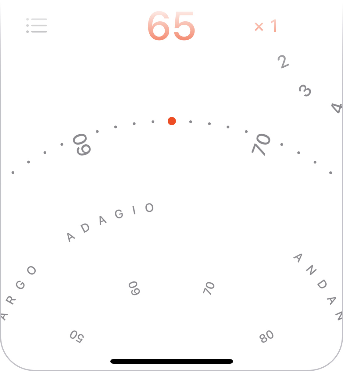
We can take further advantage of the wheel by showing a ring of numbers near the centre, which allows you to see further forwards and backwards than on the outer ring so you can grab further-away values to target. The inner ring is also meant to hint at the fact that you can turn the wheel not just on the outer edge.
To make very small tempo adjustments even easier, the wheel also allows tapping on its left and right half to move by 1 bpm.
The idea of using a wheel was a key insight, but the job was far from over. Many interaction details remained to be solved.
Rotation behaviour
The first was how the wheel should actually respond to finger movements. There’s a simple calculation used in many implementations, but it can produce some unnatural and unhelpful behaviour.
However, a challenge in finding a better solution was that you can’t really define “natural” in this context: users can and will perform gestures on a virtual wheel that have no meaningful physical equivalent. I explored many different approaches before finding a set of formulas that produced the right feel across all the different possible gestures. It also meant I finally found a use for all that trigonometry they taught us in school.

Looking to real-world controls still offered useful inspiration. For instance, a physical dial with notches, like you might find on a camera, helps you select specific values by snapping to discrete positions. I wanted to emulate this, so on Tachyo’s wheel you get “pulled” towards the round bpm values. This makes it clearer when you’ve turned it close enough to your target position. The selected dot also gets bigger to make it more visible, but only subtly so as not to distract.
Although a notched dial was the right model for making fine adjustments, the analogy stops there, because Tachyo’s speed wheel should also allow flicking, to make larger changes more quickly. The momentum is fine-tuned to feel natural, and the deceleration formula matches how real-world friction works. It differs from iOS’s native scrolling deceleration, which uses a more abstract function.
Sticking too closely to a simulation of a physical wheel would have one other limitation: you’d only have 360° to work with. This in turn would dictate how far apart the bpm values could be for a given diameter, limiting the precision of the interaction. Tachyo breaks free from this limitation, prioritising a large-enough gap between values, and as a result using much more than 360° for the total range.
Haptic feedback
Vibration can be another key element in supporting precise selection. But it’s worth thinking about exactly how this should behave. First, what is its purpose? Surely it’s to give additional, real-time feedback about your progress: you can feel as you’re passing each value and eventually when you’ve reached the target position. But what does “reaching” actually mean? In fact, letting go will always snap to the nearest round number, so being near your target position is enough. So if you’re trying to select, for example, 72 bpm, you can let go whenever the position corresponds to ≥71.5 and <72.5 bpm. The haptic feedback should therefore tell you if you’ve successfully reached the vicinity of a value, and so you should feel the vibration when you cross the midway point between numbers, e.g., 71.5.

If that sounds obvious to you, consider that, for some reason, iOS’s native revolving pickers don’t do this. They vibrate when you cross round values, for instance when you’ve moved from 71.9 to 72.1, crossing 72.0. This doesn’t make any sense as far as I can see. If you’ve inadvertently overshot, say to 72.6, letting go will make it land on 73, and you won’t have received any haptic feedback to warn you.
Tempo markings
Choosing a bpm value isn’t the only way to use a metronome. Classical music usually doesn’t specify bpm but instead uses traditional tempo markings such as “allegro” to indicate the rough speed. Although Tachyo’s speed wheel shows the most common markings, this is not the ideal way to find a tempo. If you only know the name and nothing about the speed, you’d have to keep turning the wheel until you come across the desired one. You’re scanning through an effectively randomly ordered list, which is slow: the average time required is proportional to the number of options – O(n) in computer science speak. Instead, you want an alphabetical list, where the time required increases less steeply with the number of options – O(log n). Tachyo offers such a list in a menu. Its density also means that it can offer a more comprehensive set of tempo markings than will fit on the wheel.
Setting accents
I also chose a wheel for setting whether and how often you want to hear an accented beat. However, the rotational behaviour is completely different because the wheel is much smaller and creates different expectations. But you can still tap in the top/bottom half to change its value by one stop at a time.
Seeing the beat
One of the requirements I mentioned at the outset was being able to use the metronome with the sound off. Many metronome apps use a flashing or pulsating effect to visualise beats, but this has two significant limitations. First, when playing music you want to know when a beat will happen, not when it did happen, and at slow tempos, it can be hard to anticipate the next beat if it appears suddenly, with no lead-in. Second, at fast tempos, around 200 bpm, it turns out your brain can’t actually discern the beat if it’s shown as a series of simple flashes or as movements in one direction. So even though I considered more “innovative” designs for Tachyo, a relatively traditional pendulum proved to work the best, because you can anticipate when it will next strike, and its back-and-forth movement effectively divides in half the speed your brain needs to follow. Tachyo still shows a radial pulse across the screen as a secondary signal, to help you see the beat when it’s in your periphery.
To give a realistic impression of movement, the virtual length of the pendulum is related to the speed chosen, just like in a real pendulum. But to make sure it stays visible, the distance it swings sideways is also adjusted based on the screen width.
Hearing the beat
Most interaction designers don’t often have to think about sound as a medium, but obviously for a metronome it’s central. Two goals in choosing sounds were that they should be pleasant to listen to and offer enough variety to cover a range of musical styles and personal tastes. However, a few other requirements transpired:
- You need to be able to hear the sound over your instrument.
- You need to distinguish between accented and non-accented beats, so although the two should sound related, they need to be different enough.
- Both of the above need to be achieved not just when using high-quality headphones but also though a tinny phone speaker.
Achieving all of the above involved many hours listening to hundreds of options, shortlisting candidates, then combining, testing and tweaking them repeatedly until I had a set that seemed just right.
Hidden complexity
I’m guessing that most people, even designers and engineers, would expect a metronome to represent quite a simple design challenge. Judging by just how many have been produced, it certainly seems that way. And yes, meeting the basic functional requirements is pretty easy. But once you go beyond these and try to address all the relevant non-functional requirements, it’s actually a surprisingly rich and nuanced problem, and solving it involves a diverse set of design tasks covering graphics, sound and detailed interaction design. But it’s exactly this multidisciplinary challenge that I found most enjoyable about this project.
You can get Tachyo on the App Store.
No comments:
Post a Comment