A lot our interaction with technology is indirect, through controls, such as buttons and knobs, that affect the behaviour of some part of a system in some way. A common principle for making these controls easier to understand and remember is to make their physical functioning and arrangement analogous to the functions they control. For example, you move the mouse on your computer to the left to move the pointer left. This is called a natural mapping. An example of an “unnatural” mapping is the QWERTY keyboard. Some mappings can’t really be made natural, because they involve non-spatial concepts. For instance, there is no right answer as to whether the left or the right button on your mobile phone should pick up a call.
A popular example for illustrating mappings was given by Donald Norman in The Design of Everyday Things and involves kitchen stoves:

Although some stoves at least use the two knobs on one side to control the two burners on the same side, it is not clear, without reading the labels (usually at the front of the stove, out of a standing adult’s line of sight), how they map to the front and back. Personally, I've been close to destroying kitchen utensils and causing minor injuries more than once. Norman suggests the following as better alternatives:

An obvious reason I can see for not using these designs is the extra space they need. I don’t know about America (where everything is big) but here in Europe, stovetops are usually roughly square, and I can imagine that manufacturers of stoves and of kitchens would prefer to keep them that way. In any case, I’m sure most users wouldn’t be willing to sacrifice precious kitchen space for a more natural mapping of stove controls.
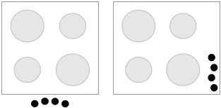
Instead of shuffling around burners, why not leave them where they are and just move the controls instead. A subtle shifting is all that’s needed (I included a version for controls on the stovetop as well):

It’s not a perfectly natural mapping, but the arrangement contains enough information to be unambiguous, and I imagine that you’d get used to it very quickly.
Yes. I like your left one...the right one doesn't seem nearly as intuitive (to me).
ReplyDeleteIf you try to see them as two vertical rows, offset and very close together, it may work better.
ReplyDeleteI don't see why the knobs need to be so big. I'm constantly annoyed by my mobile phone which has relatively large, contiguous buttons when very small, clicky buttons with load of space around them would be vastly better. A perfect spacial mapping is always preferable in my opinion.
ReplyDeleteI read a book once about the ergonomics and physical design of controls, but I don't remember what it said about knobs like this, and unfortunately I don't have access to it anymore.
ReplyDeleteBut I would imagine that larger knobs are easier to grip and require less fine motor control. Especially if you're wearing oven mitts.
True, bigger is definitely better with 'white goods' in most cases that I can think of. Perhaps the actual hobs themselves should operate like click wheels!
ReplyDeleteWe have a stove exactly like your suggested one on the left. (The position of large and small elements may be swapped, but it's essentially the same.) I turn on the wrong element occasionally, but not often.
ReplyDeleteI would solve it like this: retain the horizontal scheme, but group the knobs in pairs under the burners. This makes it obvious which pair of knobs controls which pair of burners.
ReplyDeleteThen, in each pair of knobs, make one larger and one smaller to correspond with its respective burner.
How's that?
(digging Tofu, by the way!)
Yes knobs for everything where you might have wet, greasy or even just cold fingers should be not only big, but also have a surface with lots of friction.
ReplyDeleteKammal hai, in one of the usability session in my ofice, the same example was given. Why don't you add an RSS feed to your blog?
ReplyDelete