Amar Sagoo

19 July 2006

The Non-Wheel iPod

Whenever you see the rumoured next-generation video iPod mentioned, the expected features always include a huge screen covering the front of the device and a “virtual”, touch-screen-based click wheel.

I may be missing something here, but what exactly would be the point of that? The reason the iPod has a scroll wheel is to make scrolling easier on a device that doesn’t allow more direct manipulation of screen content. If you had a touch screen, the grounds for having a scroll wheel would disappear, and you could just use a scroll bar, right? A scroll bar would allow scrolling directly to any point in a list and would involve less (and less awkward) physical movement.

Also, if you had such a nonsensical, virtual scroll wheel, you’d be waving your thumb around over the contents of the screen all the time, which doesn’t sound like a clever idea. Of course, you could dedicate a section of the screen for this wheel, but wouldn’t you rather use that space to make the list taller?

So I think either the creative minds behind the rumour sites didn’t think this one through properly, or the creative minds at Apple are making some rather silly decisions. Let’s hope it’s the former.

13 July 2006

i use this

A few days ago, i use this, a nice alternative to MacUpdate and Versiontracker, was launched. It uses a model that’s quite different from, and arguably more useful than, traditional software databases. Instead of the number of downloads (which say more about marketing than about quality) and user ratings (which only a very small proportion of the user population provide), i use this simply lets registered users mark applications they use. The resulting numbers are what drives the rankings. One advantage is that since you can also unmark an application when you’ve stopped using it, the data stays representative over time, so that the Internet Explorers and StuffIts of this world don’t skew the results.

The uptake in the first few days seems to have been quite impressive. I think it’s the aspect of personal expression (”Look, here’s what I use!”) that makes this model so attractive and gets people to happily provide the data. It also has a social component by allowing networks of friends and by showing you “neighbours”, who use similar applications.

It’s also a very useful tool for developers. The data on my applications so far looks quite unexpected. I might do a little review in a few weeks time when the site has a larger set of data.

I hope that in the future they will provide some more interesting data mining results in addition to the list of top and hot applications (which, I’m guessing, take into account how many people “love” an app). For example, I’d quite like to see the fastest recent climbers. Also, an interactive graph of the total distribution might be interesting (which I imagine would be a Long Tail).

Oh, by the way, if you’re interested, i use this.

8 July 2006

Don’t let it control you

Since I got broadband Internet a few years ago, I’ve had my email client at home checking for new mail every 5 minutes. When I started using a dedicated RSS reader, I also set that to check feeds as frequently as possible (every 30 minutes in NetNewsWire).

Earlier this year, I had to spend a few weeks without an Internet connection at home. I was able to check my email only when I made the trip down to the university library, and I stopped following the news altogether. Although slightly inconvenient, this was not as bad a situation as I had expected, and I felt that I got lots more work done this way.

When I eventually got connected again, I really felt the contrast. The RSS reader in particular was very interruptive. Unlike email, which comes in intermittently, there were updates in my subscriptions virtually every time the program refreshed them, so an interruption was almost guaranteed to happen every 30 minutes, with the green badge on NetNewsWire’s icon tempting me to see what was new. I tried to compensate by setting it to check only every 2 hours. However, it turned out that I had got conditioned to expecting news on a regular basis, and found myself glancing at the Dock icon quite often. I actually lost patience and manually refreshed the subscriptions sometimes, which only resulted in me feeling disappointed with my willpower.

My solution to this unfeasible dependency has been to turn off automatic checking in NetNewsWire. As hoped, this seems to have undone the conditioned expectation of updates, and I now manually refresh my feeds when I’m having a break. I’m sure that’s still more often than truly necessary, but at least I can concentrate on my work when I want to.

I’ve also reconfigured my email client to update every 15 minutes. I don’t want to turn off automatic checking altogether here, because sometimes you do get emails that need immediate attention. It seems that since emails are more sporadic, there is no regular interval to get used to, so you don’t actually notice that the program is checking less frequently.

Another highly effective strategy I use is to minimise the number of RSS feeds I subscribe to by using good news “gatherers” such as John Gruber, and even to dump Flickr contacts (except friends, of course) whose photos I don’t end up liking as much as expected.

If you feel like you’re getting an information overload on your desktop, I recommend you take control and make some changes as well. You’ll be surprised how easy it is to get by without being constantly connected.

21 June 2006

Stoves revisited

A lot our interaction with technology is indirect, through controls, such as buttons and knobs, that affect the behaviour of some part of a system in some way. A common principle for making these controls easier to understand and remember is to make their physical functioning and arrangement analogous to the functions they control. For example, you move the mouse on your computer to the left to move the pointer left. This is called a natural mapping. An example of an “unnatural” mapping is the QWERTY keyboard. Some mappings can’t really be made natural, because they involve non-spatial concepts. For instance, there is no right answer as to whether the left or the right button on your mobile phone should pick up a call.

A popular example for illustrating mappings was given by Donald Norman in The Design of Everyday Things and involves kitchen stoves:

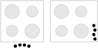
Although some stoves at least use the two knobs on one side to control the two burners on the same side, it is not clear, without reading the labels (usually at the front of the stove, out of a standing adult’s line of sight), how they map to the front and back. Personally, I've been close to destroying kitchen utensils and causing minor injuries more than once. Norman suggests the following as better alternatives:

An obvious reason I can see for not using these designs is the extra space they need. I don’t know about America (where everything is big) but here in Europe, stovetops are usually roughly square, and I can imagine that manufacturers of stoves and of kitchens would prefer to keep them that way. In any case, I’m sure most users wouldn’t be willing to sacrifice precious kitchen space for a more natural mapping of stove controls.

Instead of shuffling around burners, why not leave them where they are and just move the controls instead. A subtle shifting is all that’s needed (I included a version for controls on the stovetop as well):

It’s not a perfectly natural mapping, but the arrangement contains enough information to be unambiguous, and I imagine that you’d get used to it very quickly.

17 June 2006

Design languages

I have recently taken a great liking to the idea of design languages, which think of design as a form of communication between the designer and the user, and which provide a framework or style to work within when you’re creating a design.

Design languages are sort of like design guidelines, but specifically thinking of them as a language is helpful at several levels:

  1. It provides the designer with a repertoire of visual “expressions” and constructs that have a specific meaning, helping them to express their ideas without reinventing the wheel.
  2. It encourages the designer to stick to the rules and conventions of the platform. In the same way that you usually wouldn’t just throw a Russian sentence into a conversation you’re having in English, you shouldn’t use interface elements or interactions that your user won’t be familiar with.
  3. A language is something users can learn. They can then transfer their knowledge between systems that use the same design language.
  4. It gets the designer to think of their design as a form of communication, a way to convey the conceptual model and the functioning of the system to the user. It effectively promotes empathy.

On the Mac, the Macintosh Human Interface Guidelines (HIG) define the design language third-party developers (and Apple themselves) are supposed to use in their software. The HIG were once an exemplar of design languages. However, since the introduction of Mac OS X, rather than prescribing the design of interfaces, the HIG have developed a tendency to describe it, being frequently updated to reflect whatever new “conventions” the designers of the Finder, Mail or iPhoto have come up with, sometimes with rather unconvincing logic. The Mac’s design language has subsequently become rather bloated and flaky.

Take as an example one of the simplest interface elements of all: the pushbutton. I’m sure most long-time Mac users can easily recall what a pushbutton looked like on System 6 and 7:

In Mac OS X 10.4, it’s not so easy to say:

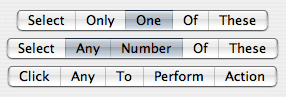
Taking the language metaphor a bit more literally, one could say that these are synonyms for the same concept. Worse than synonyms are homonyms, because they introduce ambiguity:

The segmented control can be cofigured to behave in three very different ways, and the only way to figure out which is the case is through trial and error or by guessing from the context. A more traditional way to express the same functionality unambiguously would be:

When Aqua first appeared, it was like a fresh start. It actually seemed simpler than Mac OS 9 in terms of its interface elements. However, Apple hasn’t been very disciplined with keeping it that way, and it’s quite astonishing how quickly the Mac design language has grown through influences from the different application teams' designers.

You could argue that these inconsistencies are just cosmetic matters of graphic design rather than of interaction, since the way Mac OS X’s interface functions is still relatively simple and coherent. But you have to remember that the graphical representation of the interface is the only communication channel from the designer to the user; we rely on it to understand what we can do, in the same way that you’re relying on my use of English to understand this article. It’s a language.

There’s a chapter on design languages by John Rheinfrank and Shelley Evenson in Terry Winograd’s book Bringing Design to Software (parts of this book are available online). Donald Norman has also written an essay about this entitled Design as Communication.

2 May 2006

Prefling: The State of Affairs

Some people have been asking me whether there will be an Intel-compatible version of Prefling. Unfortunately, the answer looks to be no.

Prefling relies on a neat little library which was created by Brian Webster and accompanied by an article on Stepwise. This library provided the basis for most docklings that came out when these things had their glory days. Unfortunately, Brian is not planning to port his library to Intel. This is perfectly understandable. Docklings have been deprecated by Apple for a long time, and I’m one of the last developers to still use them. The API could be killed any day, most likely when the Dock gets an overhaul (perhaps in 10.5?). Also, the dockling server is a bit flaky anyway, sometimes stopping docklings from working until you log out and back in.

Most functionality offered by docklings can now be added to normal applications by controlling their icon and Dock menu. But there’s one thing that using an application doesn’t offer, and it’s precisely the essence of Prefling’s concept: that you can show its menu with a simple click. Applications require clicking and holding or control-clicking/right-clicking to show their menu.

The only alternative I can see would be to make Prefling a “menu extra”. However, I don’t feel that it’s worth the effort, since there are already two other such solutions out there: the aptly named MenuPrefs, which is already Intel-compatible but not free, and the also very aptly named PrefsMenu, which has not been ported yet. And anyway, what would I call mine, now that all the possible permutations of “menu” and “prefs” have been used?

So, dear fans, after 29,684 Versiontracker downloads (my record so far), it looks like this is the end of the road for Prefling. I’m glad you enjoyed it while it lasted.