Amar Sagoo

17 June 2006

Design languages

I have recently taken a great liking to the idea of design languages, which think of design as a form of communication between the designer and the user, and which provide a framework or style to work within when you’re creating a design.

Design languages are sort of like design guidelines, but specifically thinking of them as a language is helpful at several levels:

  1. It provides the designer with a repertoire of visual “expressions” and constructs that have a specific meaning, helping them to express their ideas without reinventing the wheel.
  2. It encourages the designer to stick to the rules and conventions of the platform. In the same way that you usually wouldn’t just throw a Russian sentence into a conversation you’re having in English, you shouldn’t use interface elements or interactions that your user won’t be familiar with.
  3. A language is something users can learn. They can then transfer their knowledge between systems that use the same design language.
  4. It gets the designer to think of their design as a form of communication, a way to convey the conceptual model and the functioning of the system to the user. It effectively promotes empathy.

On the Mac, the Macintosh Human Interface Guidelines (HIG) define the design language third-party developers (and Apple themselves) are supposed to use in their software. The HIG were once an exemplar of design languages. However, since the introduction of Mac OS X, rather than prescribing the design of interfaces, the HIG have developed a tendency to describe it, being frequently updated to reflect whatever new “conventions” the designers of the Finder, Mail or iPhoto have come up with, sometimes with rather unconvincing logic. The Mac’s design language has subsequently become rather bloated and flaky.

Take as an example one of the simplest interface elements of all: the pushbutton. I’m sure most long-time Mac users can easily recall what a pushbutton looked like on System 6 and 7:

In Mac OS X 10.4, it’s not so easy to say:

Taking the language metaphor a bit more literally, one could say that these are synonyms for the same concept. Worse than synonyms are homonyms, because they introduce ambiguity:
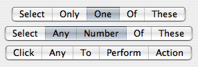
The segmented control can be cofigured to behave in three very different ways, and the only way to figure out which is the case is through trial and error or by guessing from the context. A more traditional way to express the same functionality unambiguously would be:

When Aqua first appeared, it was like a fresh start. It actually seemed simpler than Mac OS 9 in terms of its interface elements. However, Apple hasn’t been very disciplined with keeping it that way, and it’s quite astonishing how quickly the Mac design language has grown through influences from the different application teams' designers.

You could argue that these inconsistencies are just cosmetic matters of graphic design rather than of interaction, since the way Mac OS X’s interface functions is still relatively simple and coherent. But you have to remember that the graphical representation of the interface is the only communication channel from the designer to the user; we rely on it to understand what we can do, in the same way that you’re relying on my use of English to understand this article. It’s a language.

There’s a chapter on design languages by John Rheinfrank and Shelley Evenson in Terry Winograd’s book Bringing Design to Software (parts of this book are available online). Donald Norman has also written an essay about this entitled Design as Communication.

2 May 2006

Prefling: The State of Affairs

Some people have been asking me whether there will be an Intel-compatible version of Prefling. Unfortunately, the answer looks to be no.

Prefling relies on a neat little library which was created by Brian Webster and accompanied by an article on Stepwise. This library provided the basis for most docklings that came out when these things had their glory days. Unfortunately, Brian is not planning to port his library to Intel. This is perfectly understandable. Docklings have been deprecated by Apple for a long time, and I’m one of the last developers to still use them. The API could be killed any day, most likely when the Dock gets an overhaul (perhaps in 10.5?). Also, the dockling server is a bit flaky anyway, sometimes stopping docklings from working until you log out and back in.

Most functionality offered by docklings can now be added to normal applications by controlling their icon and Dock menu. But there’s one thing that using an application doesn’t offer, and it’s precisely the essence of Prefling’s concept: that you can show its menu with a simple click. Applications require clicking and holding or control-clicking/right-clicking to show their menu.

The only alternative I can see would be to make Prefling a “menu extra”. However, I don’t feel that it’s worth the effort, since there are already two other such solutions out there: the aptly named MenuPrefs, which is already Intel-compatible but not free, and the also very aptly named PrefsMenu, which has not been ported yet. And anyway, what would I call mine, now that all the possible permutations of “menu” and “prefs” have been used?

So, dear fans, after 29,684 Versiontracker downloads (my record so far), it looks like this is the end of the road for Prefling. I’m glad you enjoyed it while it lasted.

1 May 2006

The Grand Unified Download Manager

Since the introduction of Mac OS X, Apple has been doing a great job of offering more and more functionality at the operating system level that application developers used to have to implement themselves. Spell checking, Address Book, Keychain, Dictionary, disk burning and PDF support are some good examples. Almost everyone wins when this happens: users get a consistent experience and are less dependent on particular applications, and developers have less work to do and can simplify their application code. The only ones who potentially lose out are developers who had seen the gap and were actually trying to offer such a service to other applications, like, for example, Nisus Thesaurus or Adobe Acrobat Distiller.

When I recently saw this post on the Omni Group forums by Jon Hicks, I saw another perfect candidate for Apple to assimilate: the download manager. As it stands, at least six applications on my machine implement their own download managers: OmniWeb, Safari, Firefox, Camino, NetNewsWire and Transmit. And, as Jon pointed out, they all have different UIs.

So what would such an Apple download manager have to offer? It would of course need to support the most common protocols, including HTTP and FTP. (Perhaps even BitTorrent and Gnutella? Maybe not, since Apple wouldn’t want to make life any easier for those not using the iTunes Music Store.) Pausing and resuming downloads would be a must, too. The interface would need to offer enough functionality to compete with most browsers, but be simple enough for the non-geek.

Out of the applications mentioned above, I personally like OmniWeb’s download manager best, because it has a toolbar that offers some useful commands with a single click, like “abandoning” (clearing and trashing) a download. Also, all its commands have text labels. It doesn’t present any puzzles and coordination exercises in the form of little grey circles and pop-up buttons. However, I do like how other apps have managed to be more horizontally compact by putting the progress bar on its own line below the file name.

Again, someone might lose out if Apple were to offer an OS-wide downloading framework. If it offered enough functionality, it could be developers of apps like Download Wizard, iGetter and Speed Download. But, speaking with my user-hat on, I’m afraid I wouldn’t care.

28 April 2006

To afford or not to afford...

I’ve always been a bit of a pedant, and in that spirit, I would like to write about some use of terminology in interaction design that has been bugging me: affordance. If you’re familiar with the field, the lengthy debates around what the word exactly means may be an old hat to you. Here’s some quick background if you aren’t.

Affordance is a term coined by psychologist James J. Gibson in 1977 to denote the actions an object or environment allows a person to perform. For example, some of a stick’s affordances are touching, picking up and poking someone with. The word is simply a derivative of the verb “afford”.

In his popular (and great!) book The Design of Everyday Things (originally published as The Psychology of Everyday Things), Donald Norman reinterpreted the term to mean those actions which a person can readily perceive to be possible, i.e., those the environment suggests or invites you to perform. Norman’s affordances are a thus a special subset of Gibson’s affordances. They also become something that’s desirable in the design of interfaces; if a button doesn’t look like it can be pressed, the user probably won’t press it.

Norman later realised the discrepancy and has been trying to re-educate the world, who love using his earlier interpretation of the term, but to little avail. Most people nowadays still use affordances to refer to those interactions which are apparent.

It is debatable whether this is a problem. Although Gibson’s meaning is the only logical one, people jumped on Norman’s use for a reason: the meaning he introduced is a very useful concept that needed a name. One could argue that a new word should be invented to signify perceived affordances, but that’s not a very realistic undertaking, since even Norman himself has failed to change people’s minds.

What all the discussions about this terminology seem to overlook, however, is that in adopting Norman’s meaning of the noun, people have also re-applied it back to the verb Gibson’s original term was based on. To afford no longer means “to allow”, but “to suggest” or “to advertise”!

What’s wrong with “advertise”?

I get the impression that people of any particular discipline somehow love having terms that only they understand.

26 April 2006

If Microsoft had designed Finder Labels...

... they would look exactly how they do now.

When colour labels made a return in Mac OS X 10.3 Panther after years of waiting, it was a bit of a letdown. For most, this was because they were functionally the same as what the Classic Finder used to offer. Personally, however, I don't really need more than 7 colours, and the colours are distinct enough, so I don't really feel the need to customise them either.

But this doesn't mean that I was happy when I saw the new implementation. It wasn't a matter of functionality, but one of visual design. Consider this:

Somehow this look immediately made me think of Windows XP, with its overpoweringly saturated, bevelled window frames and buttons. It just didn't look like Apple. But even leaving taste aside, it simply doesn't work very well. The colours are so strong and dark that it becomes harder to read the actual names of the folders. And why those gradients? They just add more clutter.

In his book Visual Explanations, Edward Tufte explains the principle of the smallest effective difference, which implies using the most subtle visual distinctions that still achieve the desired effect. The word effective is important here. There's no point using the smallest perceivable difference if it doesn't tell the story you want it to tell. In case of Finder labels, I see two possible desired effects:

  1. To allow you to quickly spot all the files of a particular colour, whose meaning you have memorised, e.g., "All archived stuff is grey."
  2. To bring certain files to your attention that you have previously marked with that intention, e.g., "I must review this document, so I'll make it red to remind myself later."

So applying the principle of the smallest effective difference for Finder labels would mean finding a set of colours that fulfil these two purposes when set against the white background of a window.

You can now easily read all the folder names and ignore the labels if you wish, but you can still choose to focus on all the files of a particular colour. Toning down the labels also makes the selection much more prominent. (Also notice I tried to improve how the labels of selected items are shown.) Although the colours look paler, they are still bright enough to have an attention-grabbing quality, especially in isolation:

It's a real shame how simple, proven design principles like this are ignored for the sake of eye candy (and not very good eye candy in this case). I think what we need is an option in the system preferences to switch from "Shop Demonstration Mode" to "Work Mode".

20 April 2006

John Gruber goes full-time

Following a couple of years of contemplation, John Gruber of Daring Fireball has finally made writing his full-time job.

John is a great writer, and DF is my favourite Mac/technology column. His analyses are always spot-on, making it seem like he has been blessed with an unfairly large share of all the common sense in the industry. Also, through his Linked List he acts as a sort of human news aggregator/filter, saving me from having to read through all those other blogs and news sites myself.

If you make an appropriate donation, you will be rewarded with goodies such as full-text RSS feeds and cool t-shirts.

I really hope this works out for him.