Amar Sagoo

11 October 2007

Coupland and Helvetica

Douglas Coupland last night at the Bloomsbury theatre in London (at what he said was probably his last ever book reading):

...and someone said making a film about Helvetica is like making a film about off-white paint.

I think in Helvetica. I love Helvetica.

For more of his thoughts on the typeface, also see this piece in the New York Times.

1 September 2007

Making sense of standard deviation

I love the feeling of getting to understand a seemingly abstract concept in intuitive, real-world terms. It means you can comfortably and freely use it in your head to analyse and understand things and to make predictions. No formulas, no paper, no Greek letters. It’s the basis for effective analytical thinking. The best measure of whether you’ve “got it” is how easily you can explain it to someone and have them understand it to the same extent. I think I recently reached that point with understanding standard deviation, so I thought I’d share those insights with you.

Standard deviation is one of those very useful and actually rather simple mathematical concepts that most people tend to sort-of know about, but probably don’t understand to a level where they can explain why it is used and why it is calculated the way it is. This is hardly surprising, given that good explanations are rare. The Wikipedia entry, for instance, like all entries on mathematics and statistics, is absolutely impenetrable.

First of all, what is deviation? Deviation is simply the “distance” of a value from the mean of the population that it’s part of:

Deviation

Now, it would be great to be able to summarise all these deviations with a single number. That’s exactly what standard deviation is for. But why don’t we simply use the average of all the deviations, ignoring their sign (the mean absolute deviation or, simply, mean deviation)? That would be quite easy to calculate. However, consider the following two variables (for simplicity, I will use data sets with a mean of zero in all my examples):

Standard deviation vs. mean deviation

There’s obviously more variation in the second data set than in the first, but the mean deviation won’t capture this; it’s 2 for both variables. The standard deviation, however, will be higher for the second variable: 2.24. This is the crux of why standard deviation is used. In finance, it’s called volatility, which I think is a great, descriptive name: the second variable is more volatile than the first. [Update: It turns out I wasn't being accurate here. Volatility is the standard deviation of the changes between values – a simple but significant difference.] Dispersion is another good word, but unfortunately it already has a more general meaning in statistics.

Next, let’s try to understand why this works; that is, how does the calculation of standard deviation capture this extra dispersion on top of the mean deviation?

Standard deviation is calculated by squaring all the deviations, taking the mean of those squares and finally taking the square root of that mean. It’s the root-mean-square (RMS) deviation (N below is the size of the sample):

RMS Deviation = √(Sum of Squared Deviations / N)

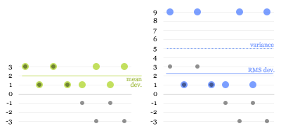
Intuitively, this may sound like a redundant process. (In fact, some people will tell you that this is done purely to eliminate the sign on the negative numbers, which is nonsense.) But let’s have a look at what happens. The green dots in the first graph below are the absolute deviations of the grey dots, and the blue dots in the second graph are the squared deviations:

Root-mean-square

The dotted blue line at 5 is the mean of the squared deviations (this is known as the variance). The square root of that is the RMS deviation, lying just above 2. Here you can see why the calculation works: the larger values get amplified compared to the smaller ones when squared, “pulling up” the resulting root-mean-square.

That’s mostly all there’s to it, really. However, there’s one more twist to calculating standard deviation that is worth understanding.

The problem is that, usually, you don’t have data on a complete population, but only on a limited sample. For example, you may do a survey of 100 people and try to infer something about the population of a whole city. From your data, you can’t determine the true mean and the true standard deviation of the population, only the sample mean and an estimate of the standard deviation. The sample values will tend to deviate less from the sample mean than from the true mean, because the sample mean itself is derived from, and therefore “optimised” for, the sample. As a consequence, the RMS deviation of a sample tends to be smaller than the true standard deviation of the population. This means that even if you take more and more samples and average their RMS deviations, you will not eventually reach the true standard deviation.

It turns out that to get rid of this so-called bias, you need to multiply your estimate of the variance by N/(N-1). (This can be mathematically proven, but unfortunately I have not been able to find a nice, intuitive explanation for why this is the correct adjustment.)

For the final formula, this means that instead of taking a straightforward mean of the squared deviations, we sum them and divide by the sample size minus 1:

Estimated SD = √(Sum of Squared Deviations / (N - 1))

You can see how this will give you a slightly higher estimate than a straight root-mean-square, and how the larger the sample size, the less significant this adjustment becomes.

Update: Some readers have pointed out that using the square to "amplify" larger deviations seems arbitrary: why not use the cube or even higher powers? I'm looking into this, and will update this article once I've figured it out or if my explanation turns out to be incorrect. If anybody who understands this better than me can clarify, please leave a comment.

8 August 2007

On pie charts etc.

On the subject of pie charts, information design god Edward Tufte has the following to say in The Visual Display of Quantitative Information:

A table is nearly always better than a dumb pie chart […]. Given their low data-density and failure to order numbers along a visual dimension, pie charts should never be used.
Although I tried for some time to convince myself and others that this is true, I have failed to come up with a really convincing argument against using pie charts. In fact, I have decided that they aren’t useless at all. Consider the following data, shown as a table, a pie chart, a bar chart and a stacked bar:

One basic feature of all the graphical representations is that they give an immediate impression about which are large and which are small contributors. The table, on the other hand, has no physical attribute that is analogous to quantity. Instead, you need to read and interpret the arbitrary symbols we use for numbers, form a more conceptual representation of the quantities in your head and compare them. You can get around this by ordering the table by value, but you’ll lose the original ordering of the items.

With regards to precision, the table obviously wins. The bar chart also offers pretty good precision as long as you don’t make it too small. The stacked bar may seem to have the upper hand over the pie chart because it has a scale, but reading values isn’t as easy as you may think. Only the first and last section are reliably easy to read. For all the sections in between, the grid lines are of little help. For example, can you confidently say at a glance whether the red section represents more or less than 50%? In the pie chart, you can at least tell straightaway that A contributes slightly over a quarter, B more than half and C around one eighth. And often that’s all you want to know. Do you really care whether an item contributes 27% or 29%? (I’m not saying that you don’t, only that that’s a question to ask when deciding what representation to use).

The stacked bar is also pretty impossible to label (no, legends are not a satisfactory solution). However, this can also be true for pie charts, especially if there are many segments and/or if they have long titles.

A further restriction of pie charts is that they don’t allow adding a further dimension to provide comparisons between different sets of data. Multiple pie charts shown side by side aren’t really comparable, because the whole structure of each pie will be different. This is where tables or bar charts can do much better.

In summary, I’d like to suggest the following guidelines for using pie charts:

  1. Use them if you want to give a high-level impression of the distribution of proportions.
  2. Don’t use them if precision is important, or include numbers if you have space.
  3. Don’t use them if order is important.
  4. Don’t use them if you need to show multiple data sets, e.g., changes over time.
  5. Keep labels short. Legends suck.
  6. If the context allows, use colours that are familiar to the viewer, and use them consistently.

Lastly, I’d like to briefly address the recently fashionable “pixel charts”. Although it’s a terrible waste of time, really. I mean, come on:

In case you still have doubts: the four areas in the following chart are all the same size:

Or are they different sizes? I’m not sure, and I can’t be bothered to count right now.

16 July 2007

Clickable control labels for the web

One of my pet peeves in web interfaces has always been that on radio buttons and checkboxes, only the small button itself is clickable. In native Mac and Windows interfaces, you can usually click on the text labels of these controls as well, giving you a much larger target, which, in accordance with Fitts' Law, makes them faster to hit.

Many, or perhaps most, people would probably never notice this difference in behaviour because they have only ever tried clicking on the button proper; the text doesn't visually suggest that it's clickable. But for those of us who are used to this shortcut, the standard web behaviour will catch us out every time. (Actually, I've started to wonder whether I'm the only person on the planet to click on the text labels, since I've never heard anyone else complain about this issue.)

Until a few months ago, I thought this was all just an unfortunate but inevitable limitation of HTML, and that developers found it too much hassle to implement a workaround in JavaScript. Then, I discovered HTML's label element. If you mark up a piece of text as a label and set its for attribute to be the ID of a form control, it becomes the "official" label for that control. The practical effect of this is that in most browsers, clicking the label will actually do something useful. For checkboxes and radio buttons, it will toggle their state, while for text fields, it will put the focus on the field. This works in Internet Explorer 6(!) and 7, Safari (I only checked version 3.0.2), Firefox and Camino. OmniWeb will do it in the upcoming 5.6 release.

So code like the following:

<input
 type="radio"
 name="os"
 id="mac"
 value="mac">
<label
 for="mac">Mac user</label>

<input
 type="radio"
 name="os"
 id="windows"
 value="windows">
<label
 for="windows">Windows user</label>

<input
 type="checkbox"
 name="loving_it"
 id="loving_it">
<label
 for="loving_it">And loving it</label>

results in nice, fully clickable controls like this:

There's also an alternative, simpler syntax that doesn't require using the for and id attributes. Instead, you can just make the label element a parent of the control:

<label>
  <input
   type="radio"
   name="os"
   value="mac">Mac user
</label>

However, this does not work in Internet Explorer 6, so if you want to be inclusive, stick with the more explicit syntax.

29 May 2007

Web site redesign

I've just launched a redesign of my web site, which makes it the fifth version, if I recall correctly.

It's based on a simple grid with six columns of 100 pixels width and 20 pixels in between. Those are pretty much the same dimensions as I used for UIScape.com, and I've found them to work quite well: narrow enough to allow some flexibility and wide enough for most content. However, it only works if you have a very narrow sidebar. (With UIScape, I had to cheat by adding another 20 pixels on the right.)

I used to have a strange aversion to using non-white backgrounds, but this time I had a very particular look in mind, so I decided to just go for it. I was going to at least use PNGs with transparency for all the graphics, but too many people still use bloody Internet Explorer 6, so the background colour is fixed in the images.

This new site includes Google Analytics code for tracking statistics. I think this may be causing a delay when loading pages. I hope this is not too noticeable or at least not too bothersome for people. (Basically, I load and run the Google Analytics JavaScript at the start of the page, because I make in-page calls to it for tracking downloads and outbound links. If you know of a way around this, please let me know.)

14 March 2007

UIScape

When I spent three months at Microsoft Research last year, I came across a lot of fascinating work related to interaction design. Colleagues would talk about their projects, people would report back from conferences, visitors came in to present their work, and I found things during literature reviews. Some of the designs I saw and read about were so cool that I couldn't believe they weren't more well known. Even my friends and I, who were supposed to be into design and human-computer interaction, hadn't heard about them. There was an obvious problem here.

I think the reason for this lack of dissemination is that the main way for researchers to make their ideas known is through conferences, journal articles and coffee-break chats. All three of these channels have only other researchers at the receiving end.

Most of the published literature is available online, but very often not free of charge. Researchers usually have access to relevant digital libraries through their employers, but designers and other potentially interested people are unlikely to be willing to pay.

Of course, many papers are available for free. However, a further barrier is that the format and language of scientific papers is not what non-researchers would consider an easy and engaging read. Given this "language barrier", as well as the prerequisite knowledge required for a lot of the material, you won't find many people casually reading the latest CHI conference proceedings on the train or flipping through a 20-page research study during their lunch break.

There is one web site which has addressed this same problem, albeit not for interaction design-related research. Ars Technica's Nobel Intent journal supplies those who have a casual interest in science with digests of interesting studies. These are written in a fairly casual style, usually include any necessary background knowledge, and only take a few minutes to read.

It didn't take much ingenuity to realise that such a model may be exactly what is needed to break the barrier that I had witnessed in human-computer interaction research. I got a few friends from university to join me in the effort to get something rolling. Well, after a few months of planning, designing, building and writing, the result is finally here:
http://uiscape.com

I sincerely hope you find it interesting and that it will help get many more people excited about the work that's going on out there.

If you have any questions about the concept or design of the site, you can comment here or email me.

24 February 2007

Scrolling and white lies

I recently had to implement an HTML table in a web application that would display and allow editing rows of data. However, the number of rows you’ll get in the data is very uncertain. To avoid a ridiculously long web page, the table should not grow beyond a certain height and should instead show a scrollbar when there are more rows than can fit.

One thing that I find can be quite annoying is if a table is just a little bit too short for its contents, so that you end up with a single row off the bottom, for example an eleventh row in a table that is only ten rows high.

As a little experiment, I decided to make use of the table’s flexible height to prevent this situation: we would display an extra row if the number of rows is only one more than our ideal maximum height. So if your ideal limit is ten rows, it would stretch to accommodate up to eleven rows. For twelve rows or more, only ten would be shown at a time. This way it always feels like the scrollbar is justified, because it’s never just to get to that one extra row. I think it’s unlikely that users would notice this behaviour.

However, I am not sure whether this is a valid design decision. One could argue that since your true maximum is eleven rows, not ten, you are making life a little bit harder than necessary for your users whenever they have to scroll. Also, I have no empirical information about whether and how much people actually get frustrated in cases where only one row is out of bounds. It almost becomes an ethical question: is it worth a white lie?

I think the approach may be valid in some cases, but it depends on several factors:

  • What is your maximum height? If your table can grow fairly high before showing its scrollbar, the cost of sacrificing a single row for this trick is less. However, if it can only be a few rows high, you are depriving users of a significant proportion of display area.
  • How likely will you exceed that maximum? If scrolling will be necessary in the majority of cases, it may be wiser to grant people the extra height to maximise how much they can see at a time.
  • How linear is the task? If people only need to read down the list of rows once, having to scroll a single row into view at the end is no big deal. But it might get frustrating when they have to repeatedly jump back and forth to compare or edit rows.

In my case, the table is fairly likely to contain tens or hundreds of data rows, and I only have space to show about a dozen at a time. So scrolling will often be necessary, and users will probably value every row they can fit on the screen. I’m not sure yet how likely people are to scroll back and forth, but the other two factors are probably enough to outweigh any gain in happiness that might result from not having a single row out of bounds.