Colour management is a pretty arcane subject to most people, even if it’s relevant to their work. I recently spent some time trying to understand it, and encountered two challenges. First, I didn’t find any really clear explanation of the concepts involved. Some are thorough but difficult to follow. Others give practical advice without elucidating the fundamentals. The second problem is that there’s conflicting advice about best practices when designing for the web.
I’d like to take on the challenge of addressing both of these issues. I will first explain some of the basic concepts behind colour management, using illustrations that hopefully make it easier to understand. I will then talk about practical implications for web-oriented design.
How it works
Colours can be described in different ways, for example as a mix of red, green and blue light, or in terms of their hue, saturation and lightness. In each of these colour models, you can think of the dimensions as forming a "space". One such colour space is called CIE xyY, and I’ll use it for my illustrations here. It contains all the colours visible to the average human eye, and has the convenient property that, although it’s three-dimensional, you can look at it "from above" and get a nice, two-dimensional map of chromaticities at maximum brightness:

When you’re working on a particular display, it’ll only be able to show a subset of all visible colours. This range is called its gamut and will have a triangular footprint in the CIE xyY space (as will any other RGB space):

If a colour profile describes a sub-space like this which exactly corresponds to the range of colours your display can actually show, it’s said to be perfectly calibrated.
Now, let’s pick a particular colour, for example this yellow:

This colour’s position in relation to our display’s space (not to the entire xyY space) will be represented by an RGB colour value, say, #FFFF00. This device-dependence may become clearer if we "take out" the triangle and show it on its own, with the colour marked at the corresponding point (remember, though, that this is a two-dimensional simplification):

In isolation from a colour profile, this is all a colour value is: a position within an abstract space that doesn’t intrinsically map to any particular, real colour. This is why the same value can represent different colours on different displays or when using different profiles. These values are what gets saved in an image file. However, you can choose whether to include a profile describing the space the colour value is meant to be relative to:
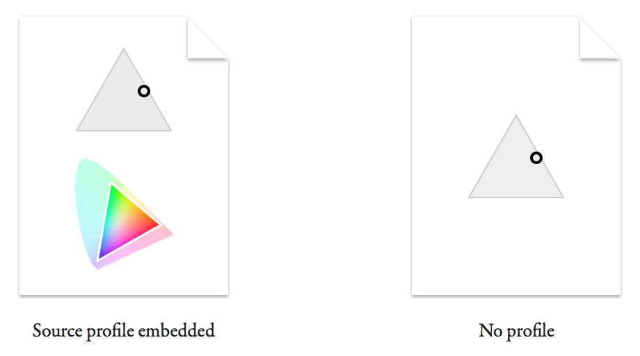
You can imagine how a viewer of the file with no profile will struggle to know the real colour originally intended. I'll explain in a minute what happens in this case.
First, let’s see what a colour-management-enabled app does with the first file. If it honours the embedded source profile, it can map the colour value back onto a real colour in the xyY space:

Now we need to figure out how to get the viewer’s display to show this colour. The value #FFFF00 was a representation specific to the source space, and may not mean the same thing on this display. Let’s say it has a smaller gamut:

In case it’s not clear, the larger triangle outline represents the original display’s gamut (our source space) and the smaller one the target display’s. The circle representing the colour is in the same spot within the xyY space as before.
(For simplicity, I’ve made the colour fall within the gamut of both displays, and am assuming that we don’t want to intentionally shift the colour on the target display. In real life, these assumptions often aren’t true. The original colour may not be reproducible on the target display, or you may want to sacrifice colour accuracy in order to preserve the relationships between colours. This is where rendering intents come in.)
The value we use to represent the colour in the target monitor’s space is related to its position within this new triangle:

What we’ve just done is to convert the colour value #FFFF00 from its source space into a different target space, giving #77FF00. This is the value we need to send to the viewer’s display to reproduce the real-life colour we chose at the start.
In other words, converting is to express a colour relative to a different colour space.
What about the file with no profile? All it tells us is a colour value. The best we can do is to make an assumption about what space it is intended to be in relation to. What often happens is that the colour value gets sent to the display as it is, without any conversion. This is equivalent to assuming that it was intended in the target display’s space. (Note that this is also what happens in applications that don’t colour-manage, even if your file includes a profile.) Let’s see where the colour value falls if we do this (I’ve marked the original, intended colour for comparison):

Because the target display’s gamut doesn’t extend as far into the green region, the value #FFFF00 maps to a colour that’s more orange than what we originally picked. This difference can be much worse if the source and target profile are even more dissimilar.
A common way of trying to minimise colour shifts in non-colour-managed contexts (or for files without profiles) is to express your saved colour values in relation to a space that’s close to that of most displays. This is what the sRGB space is intended for. Most modern displays have a gamut similar to sRGB, so in most cases sRGB values should not look completely off when sent straight through without conversion. It’s often advised that you use sRGB while working on images for the web in Photoshop, rather than specifying colour values relative to your display’s profile. (While you’re working, Photoshop will convert the sRGB values to your display’s profile. To preview how they would look unconverted on your display, turn on Photoshop’s Soft Proof feature and set it to Monitor RGB.)
Web design
As I implied at the beginning, user interface and web designers looking for colour management advice may feel like they are caught between two warring factions. One advocates setups that enable accurate colour management according to the principles I explained above. The other will encourage you to circumvent colour management as much as possible. What’s going on here?
Designers working on the web often seem to think of colour in terms of colour values, rather than in terms of “real”, perceived colours. They get stressed out if the colour value they measure when their graphic is displayed in a browser doesn’t match the value they originally typed in. To someone who works in photography or publishing and is used to a colour management workflow, this must appear like pure ignorance, given what we learned above.
However, there are valid reasons why these designers care about colour values: on a web page, images often represent parts of the design that need to match other elements on the page exactly. The colour of these other parts is often specified in CSS and rendered by the browser. In 2015, most browsers don’t convert CSS colour values, instead sending them to your display unchanged. This means that there’s no way to guarantee that a CSS colour and a colour in an image with a profile will match, and so you’ll often see slight differences.
So the reason the two groups of people cannot agree is that they care about different things. One cares about reproducing colours as faithfully as possible on as many devices as possible – consistency between contexts. The other cares about colours in an image matching colours elsewhere on a web page – consistency within a context.
There is a hypothetical solution that would satisfy both use cases, which is for all browsers to colour-manage CSS colours by assuming they are expressed in sRGB rather than the monitor’s profile. That’s how the W3C would like it to work. In fact, Safari 7 and 8 do exactly this, as well as assuming sRGB for images without profiles (although there’s still a slight mismatch between CSS and images, presumably because of different rendering intents being used – perhaps a bug). However, until this behaviour becomes standard across browsers, embedding profiles in certain web graphics will for most users produce inconsistent colours within a page.
What to do
When producing images for display on the web, there are essentially two different use cases, each calling for its own strategy.
When faithful reproduction matters more than consistency with surrounding elements (for example in a photo), it makes sense to aim for full colour management. I’d use sRGB as the working space/document profile if the software allows it (or a wider-gamut standard like Adobe RGB if you want to maintain a broader range of colours until you export), and view a real-time conversion to your monitor’s profile while working. You’ll want to minimise colour shifts when your image is viewed in non-colour-managed contexts, so if it’s not already in sRGB, this means converting to sRGB when exporting. To encourage apps to colour-manage it whenever possible, embed the colour profile in the exported file.
When designing web page elements that need to be consistent with other colours on the page (for example, a logo, icon or button), you probably care about preserving colour values as you specified them. Here you can dismiss colour management while designing, either by working in your monitor’s colour space (as Sketch does, for instance) or by working in sRGB and ignoring any conversion to your display (or, if in Photoshop, turning on Soft Proof to Monitor RGB). When saving, you don’t want any conversion to happen. Lastly, you shouldn’t embed a profile, so that even colour-managed apps are encouraged to send your colour values straight to the viewer’s display. In a browser like Safari which assumes sRGB, the colours in your graphic will get converted to the viewer’s display profile, but so will CSS colours, so the design will still look internally consistent.
Final thoughts
I imagine that one day Chrome, Firefox and Internet Explorer will colour-manage CSS like Safari does (Firefox already has a hidden mode for this). When that day comes, sRGB will become the standard space for defining colour values on the web. At that point, designers could use it as their working space, and have colour management applied both while they work and in their exported files. This would let them have confidence that colours will match CSS, but would also give them a more accurate preview of what their users will see.
In essence, the anti-colour-management behaviour we’re sometimes having to adopt today is caused by a technical aberration, which will hopefully prove to have been temporary.
[This article was updated in August 2015.]
No comments:
Post a Comment